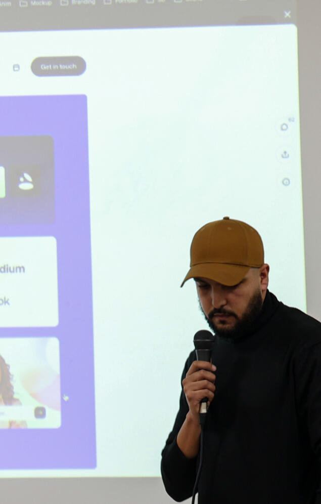
Mustapha Gadrouz
Senior Creative Lead, Multimedia Manager & Brand Specialist
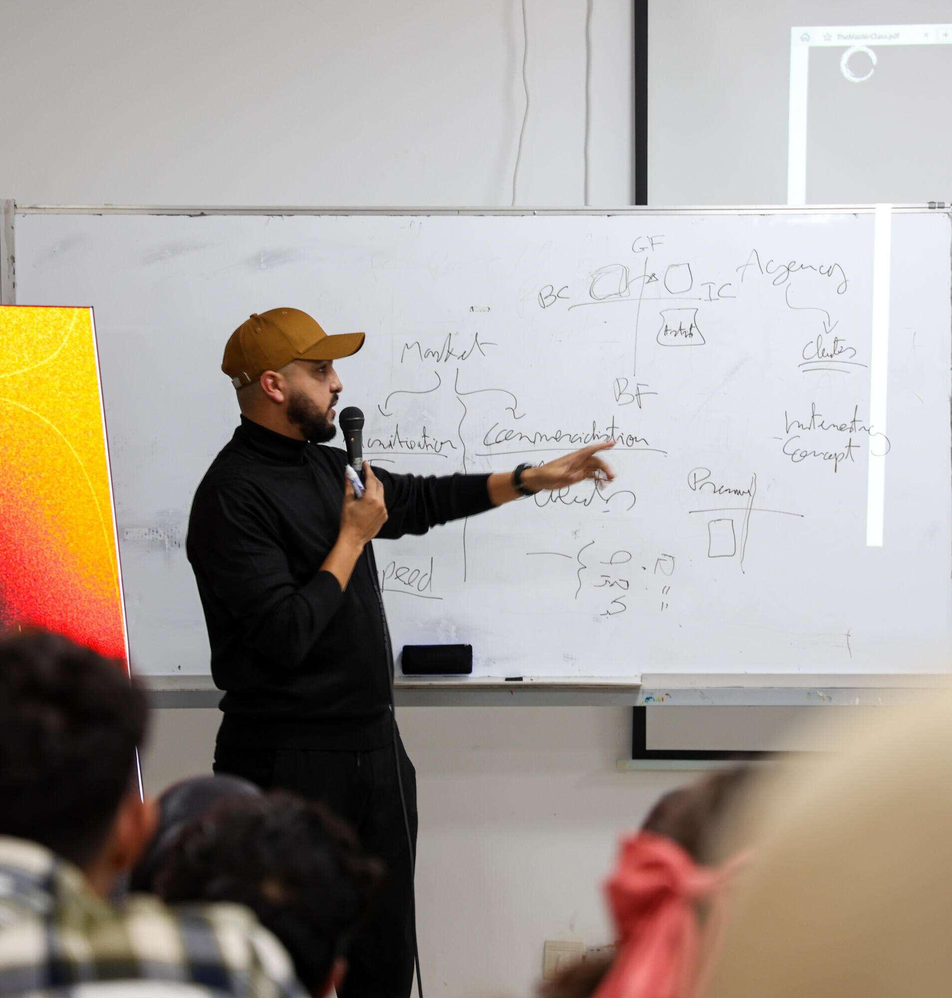
I am Mustapha Gadrouz, a Senior Creative Lead & Multimedia Manager with over 12 years of experience bridging the gap between complex business objectives and high-impact visual narratives.I specialize in helping founders, startups, and industrial organizations diagnose where their brand is misaligned and how to fix it before they invest further in execution. My work operates at the intersection of brand strategy, visual systems, and market perception.Throughout my career, from directing national media projects like MasterChef Junior to managing global creative workflows for international clients, I have developed a unique ability to translate business complexity into clear, actionable creative direction.
© Mustapha Gadrouz. All rights reserved.
Testimonials
These are testimonials from clients I’ve worked with across different countries and industries on their projects, whether in branding, creative direction, or design work.
Stories
Selected work from my time as a solo creator and agency collaborator. Covering everything from Multimedia to Art Direction and Branding, I dive into the challenges and the stories that shaped each project’s success.
20 Supercars and a Last Minute Pivot
One of the biggest challenges I faced in my career as an art director.How we executed a luxury car photoshoot for a Moroccan brand specializing in high-end car rentals.At the last minute, the location changed, and I had to quickly adapt to a completely new environment with different lighting conditions and setups I wasn’t prepared for.
Beyond the Boardroom: Elevating Corporate Events through Art Direction
How we transformed a standard corporate gathering into an immersive, art-led experience. Discover how strategic art direction and a touch of flair turned 'boring' into 'unforgettable' for every guest in the room.
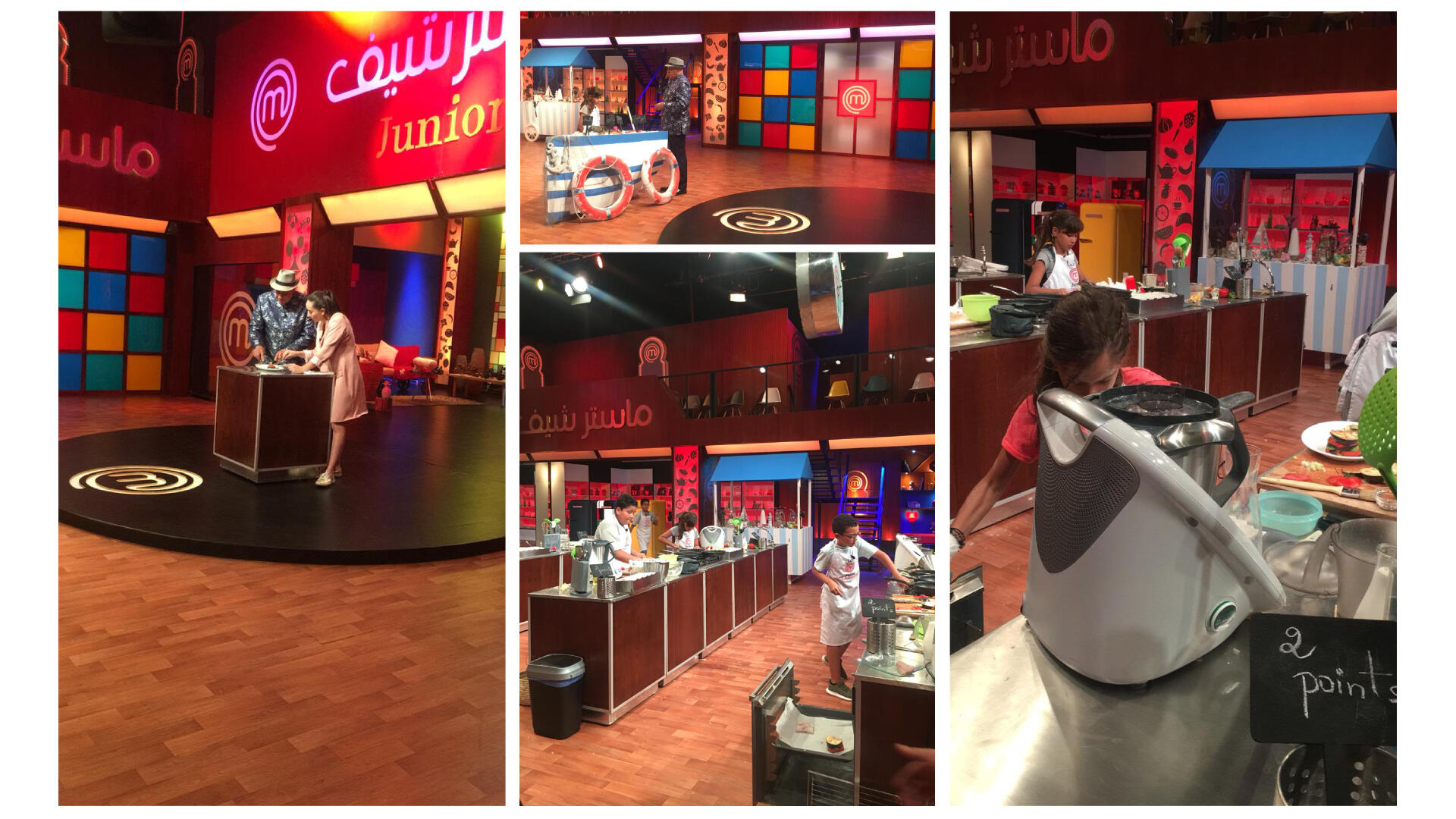
Digital Art Direction and Coverage for a Major TV Franchise
This project was a masterclass in creativity, travel, and the power of human connection. From the fast-paced energy of the main studio to the authentic moments captured off-camera, discover how we brought the magic of this competition to life for a digital audience.
Branding: Your Business’s Greatest Asset (Or Its Secret Liability)
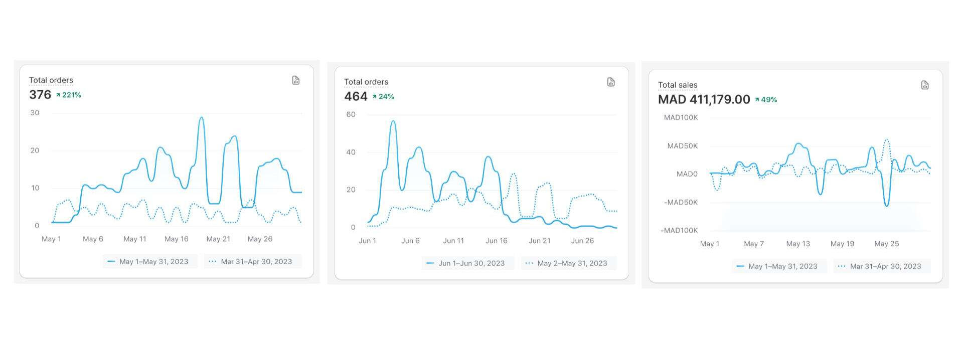
How an e-commerce furniture brand recovered from a 46% revenue drop to achieve a 221% surge in monthly orders through strategic branding and direct collaboration with Meta. This story explores the journey of hitting 464 orders in a single month and the critical lesson of why infrastructure must scale alongside sales to prevent a total collapse.
Branding: Your Business’s Greatest Asset (Or Its Secret Liability)
Between 2022 and 2023, while I was sharing branding content on social media, I consistently emphasized one point: the way business is conducted has fundamentally changed over the last two decades. Even if you have the best products, the sharpest marketing strategies, and the most efficient sales funnels, you still might not have a competitive advantage. In the age of the internet and e-commerce, everything can be copied. Anyone can replicate your business model, your marketing tactics, or your sales strategies.This was a pain point many brand owners felt deeply. I always told them the solution to this vulnerability is Branding. While competitors can copy what you do, they cannot copy who you are. When you invest in solid branding, the market notices. If a competitor tries to imitate you, the audience immediately recognizes it as a copy of your brand. This gives you a permanent advantage in the market, even before considering the legal protections branding provides.
The Challenge: The Invisible Ceiling
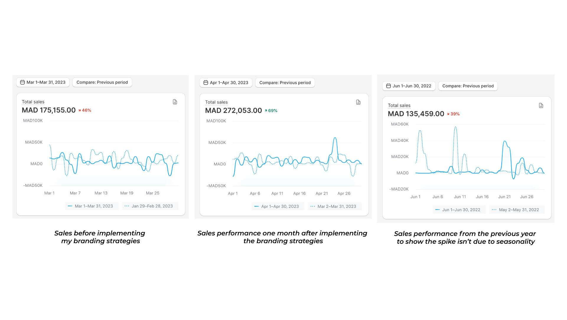
A business owner in the home furniture sector back in March 2023 reached out to me for help with his branding. He understood a difficult reality: you can do everything "right" in marketing and sales and still hit a revenue ceiling. As time passes, competition increases, and players begin fighting over price, often cutting margins until the business is running at a loss just to maintain a presence.This client operated a 100% e-commerce, Direct-to-Consumer (D2C) brand. He had no showroom, only a factory where he manufactured his products and sold them directly via social media and his online store. He told me, "I am doing everything correctly, but my revenue is steadily dropping." My answer was clear: branding was the missing piece of his puzzle.Let’s Clear the Air: Branding is NOT Just a Logo
Before moving forward, we need to debunk a major myth. Most people hear "branding" and immediately think of design. That is a mistake.Branding is anything that relates to how people trust your business, interact with you, and recommend you to others. This does not just apply to clients; it includes suppliers, investors, banks, and institutions. They will not trust you simply because you have a nice logo or pretty colors. They trust you because your business is solid from every angle, consistent, and professional from A to Z. That, in short, is the true essence of branding.
The Strategy: The Ferrari vs. The Civic
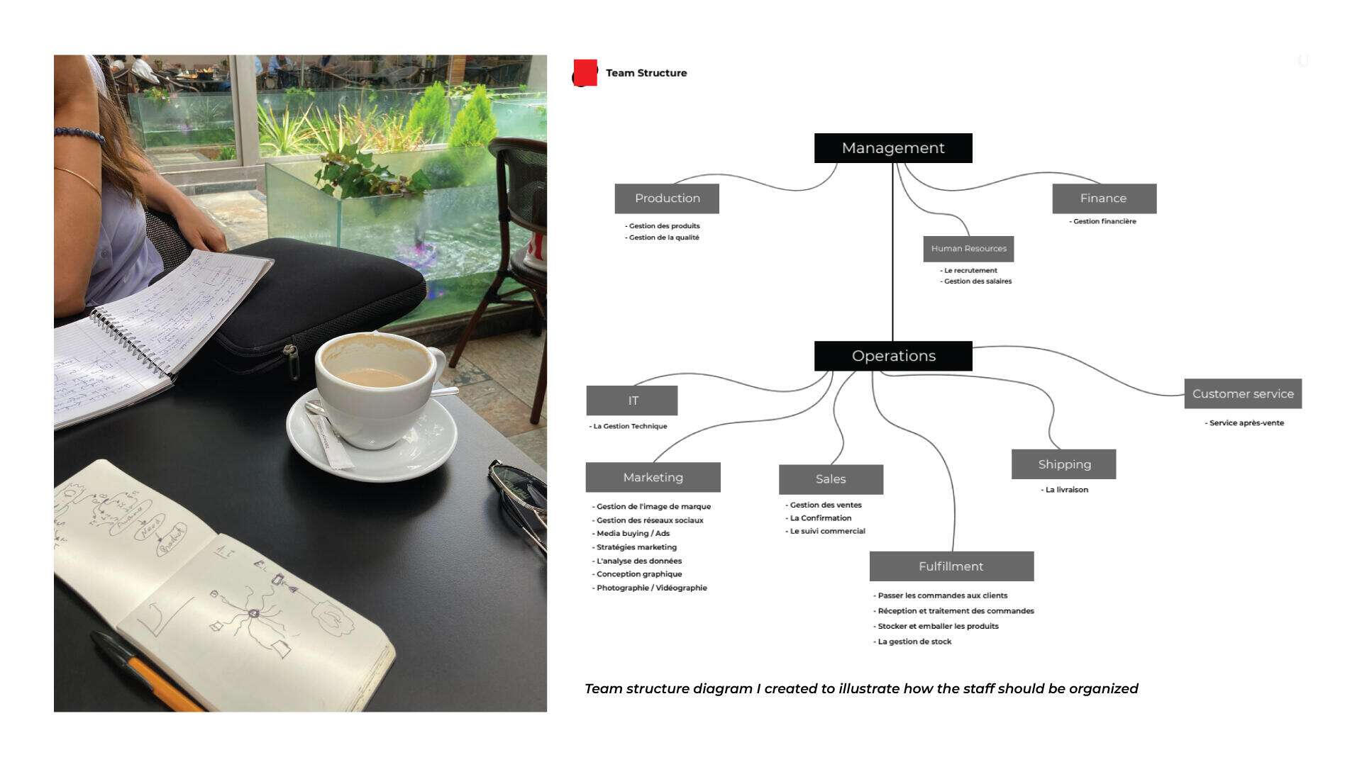
To begin, we held multiple strategy sessions to audit every aspect of his business, from production until the product reached the customer's door. During these sessions, I noticed a significant issue: his staff was too small to support the sales numbers he wanted to achieve.Many entrepreneurs fall into the trap of thinking that increasing revenue only requires more marketing effort or a bigger ad budget. This is false. If you want to scale sales, you must scale your team. More sales mean more orders to fulfill, more products to produce, more customer support tickets, and a need for more account managers to track logistics.I told the client that I was confident we could quadruple his numbers by the end of the year, but only if he scaled his team alongside our strategy. He was hesitant to take that risk initially, but I knew that once the results started coming in, he would see the necessity.
Solving the Trust Gap
We began by building strategies to solve the brand's core problems:- High-Ticket Trust: Customers were hesitant to pay over 3,000dh upfront for large furniture items without a physical showroom.- Product Perception: Customers were only buying small "bridge" products rather than the high-value items the business relied on.- Retention: Previous customers were not returning or recommending the brand.- Ad Dependency: The business stopped receiving orders the moment Meta Ads were turned off.Within the first month of implementing these strategies, we saw immediate results. By the second month, those results had doubled again. This was not a seasonal fluke; a year-over-year comparison proved that our branding strategies were working.
The Direct Line: Collaborating with Meta Marketing Pros
Because Meta was the primary engine for growth, I chose to leave nothing to chance. To ensure our strategy was both brand-friendly and high-performing, I coordinated directly with the platform. I scheduled a consultation with a Meta Marketing Pro to audit our account structure and refine our creative approach.During this session, we focused on aligning the artistic flair of the brand with the technical requirements of the Meta algorithm. This collaboration was key in preparing the account for the massive scaling we achieved in the following months. It ensured that our explosive growth was built on a technically sound foundation that prioritized both user experience and brand integrity.

Snippet from a meeting with the Meta agent responsible for the MENA region
The Hardest Decision: Walking Away
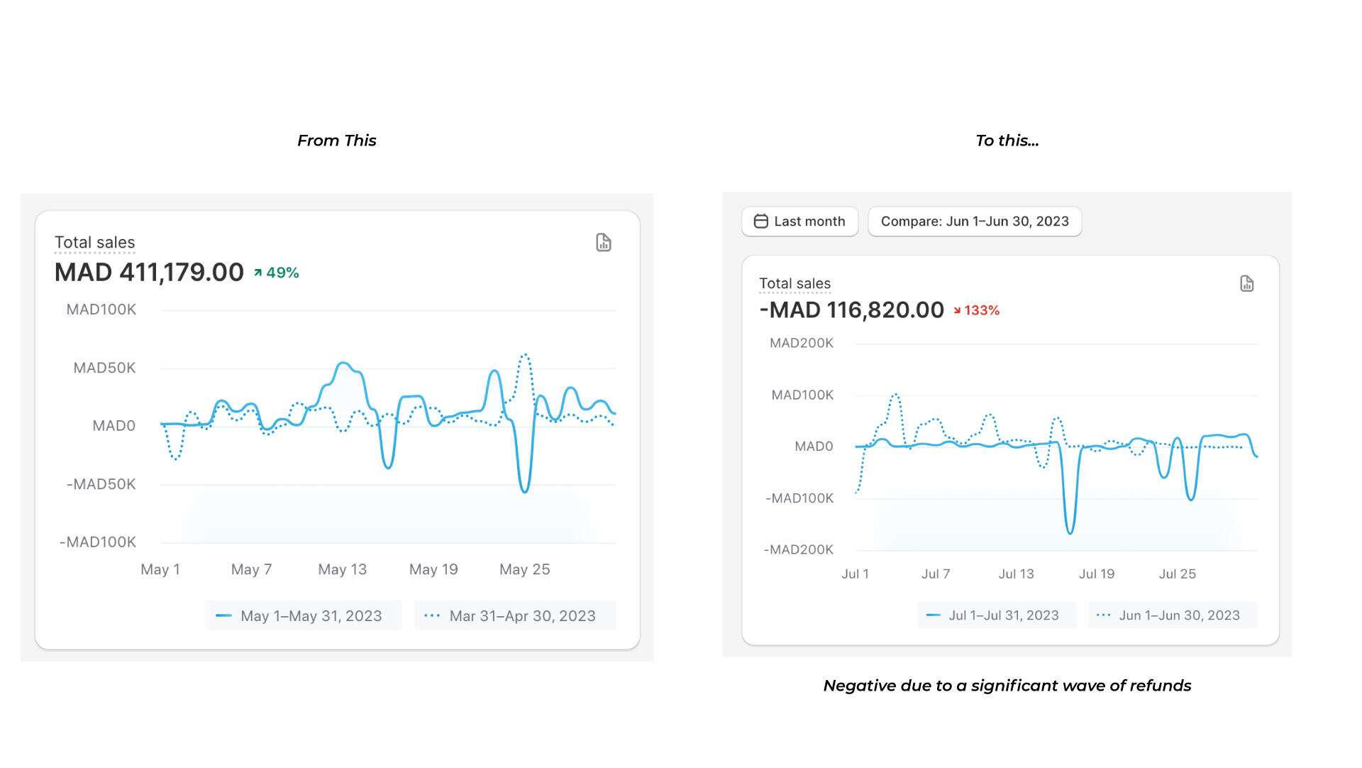
Everything was going perfectly, and I expected the owner to follow my recommendation to scale his staff. Instead, he refused to listen and continued to push for more growth because he saw the numbers climbing.I had to stop and explain the looming danger. I told him that with more orders and less staff, shipping would be delayed, quality would drop, and the small team would burn out. I gave him a clear warning: "You cannot put a Ferrari engine inside the body of a Honda Civic. It might start, but it will blow up in your face eventually."When the results doubled again the following month and he still refused to hire help, I made the difficult decision to stop working with him. I cannot continue a project where the client refuses to help themselves.
The Prediction Comes True
Exactly what I predicted happened. The following month, the business was hit with a wave of refunds due to poor quality, at a level they had never seen before. Instead of tripling their results as he expected, the business crashed because of the operational bottlenecks I had warned him about.
It is deeply unfortunate when stubbornness gets in the way of success. Many entrepreneurs fail to see that a business is a complex machine; if you change one component, it affects the performance of the entire system.As a branding specialist, I must understand this entire ecosystem. Before working on any strategy, I need to know what it takes to make it work perfectly without causing the whole structure to collapse. While I was proud that my work had such a massive impact in a short time, the success was cut short by a focus on only one part of the machine.
If you want to learn more about the specific strategies I used for this brand or view the detailed case study, please reach out to me privately. Due to privacy and NDA agreements, I cannot share further details publicly.
Digital Art Direction and Coverage for a Major TV Franchise
The Opportunity
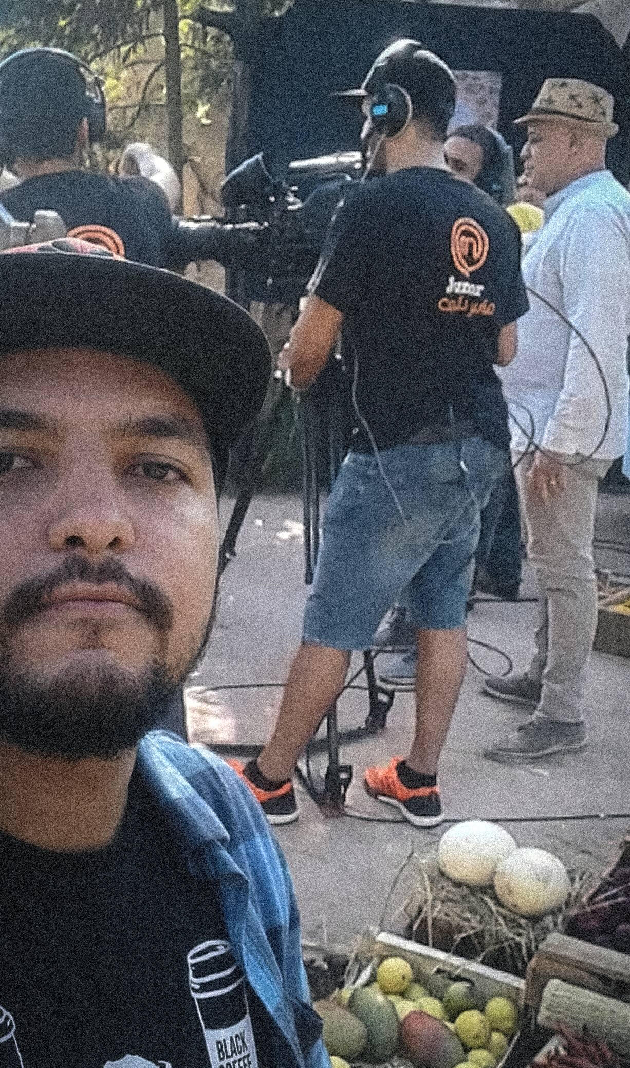
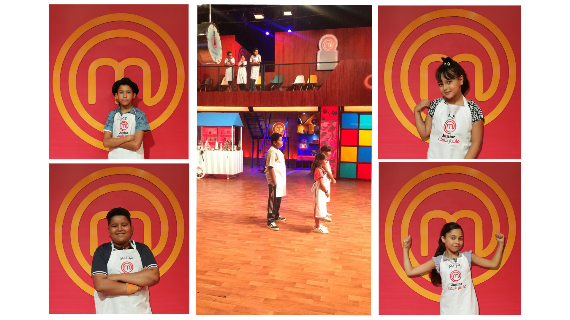
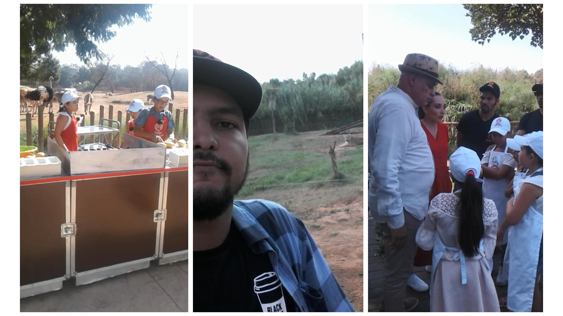
While I was working as an Art Director with Digiwork, I had the chance to lead one of the biggest projects of my entire career. It was for a television show that needs no introduction anywhere in the world: Master Chef. Specifically, we were working on the Master Chef Junior edition, featuring talented young chefs.To be completely honest, this was one of the most enjoyable and rewarding projects I have ever been a part of. It was so different from the typical routine. For starters, I wasn't stuck behind a desk in an office. I was constantly on the move, traveling from city to city depending on where the episodes were being filmed. Entering the world of TV production and seeing how these massive shows are built from the ground up made me feel like a kid in a candy shop.My Role on Set
My primary responsibility throughout this project was to oversee all the content being captured for the show's official social media channels. We provided live coverage of every event and interaction between the contestants. This included capturing behind the scenes moments both during the heat of the competition and during their down time off camera.
The Human Challenge
This project presented a challenge that was unlike anything I had faced before. Usually, challenges are technical or logistical, but this time, the challenge was purely human.Because I was working with children between the ages of 10 and 15, I had to make sure they felt completely comfortable around me. They needed to trust me so they wouldn't feel distracted or uncomfortable by the fact that I was following them with a camera all day. I had to lead with kindness and empathy. If those kids didn't like me or trust me, they wouldn't have given me the access I needed to capture authentic moments. If that had happened, the quality of our content would have suffered significantly.The Outcome
Fortunately, I formed a great bond with the kids, and they grew very fond of me. The project moved along smoothly through every stage, whether we were shooting indoors or on location outdoors. It reached a point where the kids actually started suggesting shots to me. They knew their families were following their daily lives behind the scenes, and they wanted to share those moments.
Key Takeaways
This experience taught me that being a great Art Director isn't just about technical mastery. It is not enough to just be good at the craft. Sometimes, a project places you in a position where your "human" skills are just as important as your "artistic" ones.Success often depends on your ability to communicate and connect with everyone, from young children to adults. In this case, the success of the entire project relied on the quality of the relationship I built with my subjects. That is the beauty of this profession; it provides life lessons that go far beyond the screen.
In Action
This video is a compilation of moments captured across various sets. It really shows the excitement I felt every single day on this project. From the high-energy atmosphere of the main studio to the beautiful outdoor settings we visited across Morocco, every moment felt like a new adventure.You can see me in my element here, fully immersed in the "flow" of the production. Whether I was adjusting a shot in the studio or capturing content on the move, the fast-paced nature of TV production kept me inspired. It was one of those rare projects where the hard work truly felt like play, and I think that energy shows in every frame.
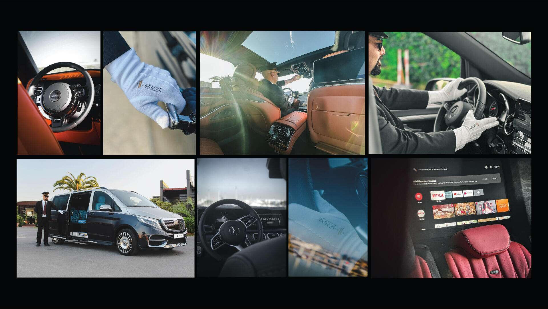
Beyond the Boardroom: Elevating Corporate Events through Art Direction
The Collaboration
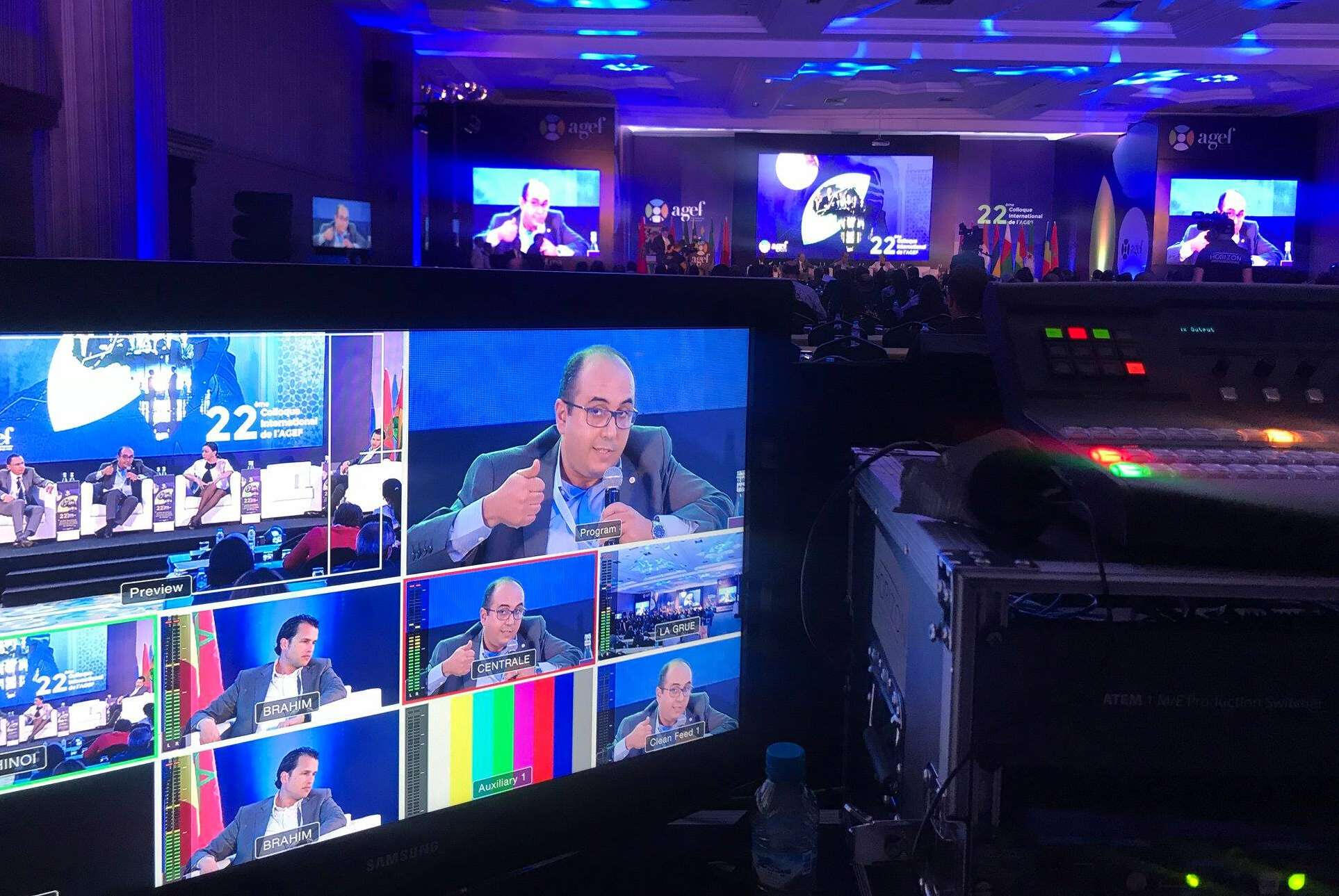
Looking back to 2018, I was working as an art director with Digiwork, which was primarily a digital agency. We often partnered with other companies in the events industry, specifically Andal Design and Horizon Prod. There was one person I worked with closely, someone I still respect and call a friend today: Si Youssef Bechar. He appreciated my work and proposed that I join them on a new project.Since I was mostly focused on digital products at the time, I assumed it would be a web or app project. However, Youssef told me it was a physical event. He wanted me to step in as the Art Director to provide the creative touch and unique vision I was known for. I have always loved a good challenge, so I accepted the offer immediately.The Corporate Challenge
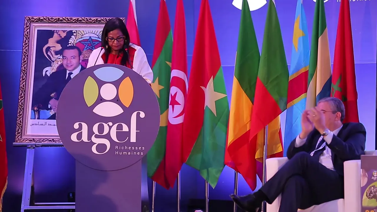
The project was an event for an organization called AGEF, which focuses on Human Resources. It was a large, international annual seminar where HR specialists, government officials from the Ministry of Employment and Labour, and high-ranking representatives from across Africa and Europe gathered to discuss industry topics.Typically, these types of events are "too corporate." In other words, they can be artistically dull. There is usually very little focus on aesthetics, key visuals, or the overall ambiance. They often follow the same repetitive format every year. You can see from the photos just how formal the environment was.
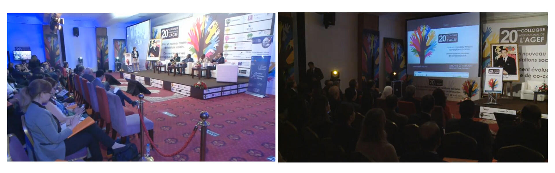
Injecting Life through Motion Design
For that specific year, Youssef and his team wanted to break the mold. They wanted the event to feel vibrant and artistic. Since the organization had recently debuted a new visual identity created by Andal Design, we needed the event itself to feel alive and move away from that stiff corporate atmosphere.The designers at Andal Design created beautiful key visuals that served as the foundation for everything. My role was to take those visuals and elevate them. To make the event feel truly dynamic, static designs were not enough. We needed to move into the world of motion design.Since the set was filled with TVs, digital displays, and a massive stage screen, we decided to utilize every inch of that digital real estate. I developed a series of motion design elements, including animated intros, section titles, and dynamic speaker introductions. Every visual aspect of the event was touched by motion, adding a sophisticated and modern layer to the experience.The Final Push
I worked through the entire night before the event started. I didn't sleep a wink because I wanted to ensure that every transition and every frame was perfect. I also collaborated closely with the lighting engineer to share my ideas and synced with the music producer to make sure our work was harmonized. We wanted the visuals, the light, and the sound to move as one.By the time morning arrived, the guests began filling the hall. It was a beautiful space, but as everyone took their seats, my heart started racing. We were about to see the audience reaction to what we had built.Despite the exhaustion of the drive from Casablanca to Marrakech and the lack of sleep, the adrenaline took over. I couldn't even sit down. I was completely focused on the execution, watching to see if the team would implement the vision exactly as we had planned.Look at bro having a heart attack lol
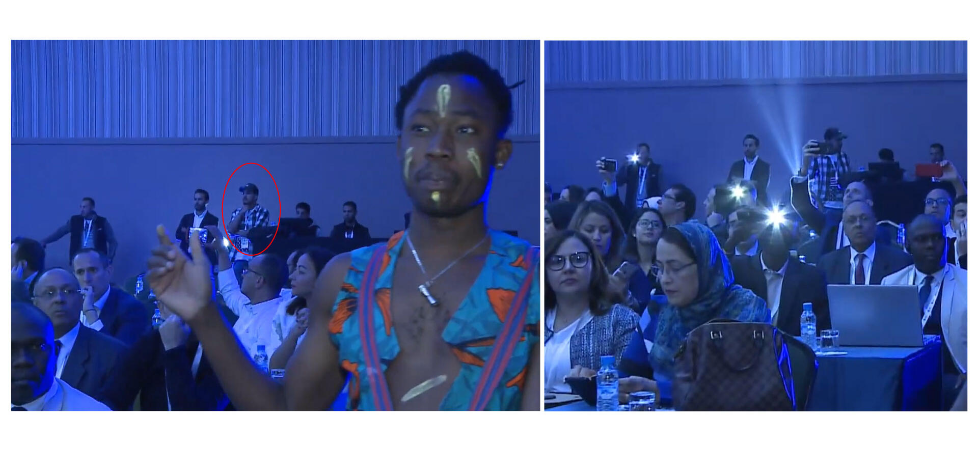
The Result: Art Direction as Magic
The event turned out to be a massive success. The new style and modern approach were a hit with everyone. It lasted for three days and ran incredibly smoothly.This is the true magic of good art direction. You cannot create a memorable experience for people without a clear creative vision. Art direction ensures that an experience is unforgettable, taking a boring, formal environment and turning it into something full of life and energy.Here is a summary video featuring highlights from the event.
20 Supercars and a Last Minute Pivot
The Call
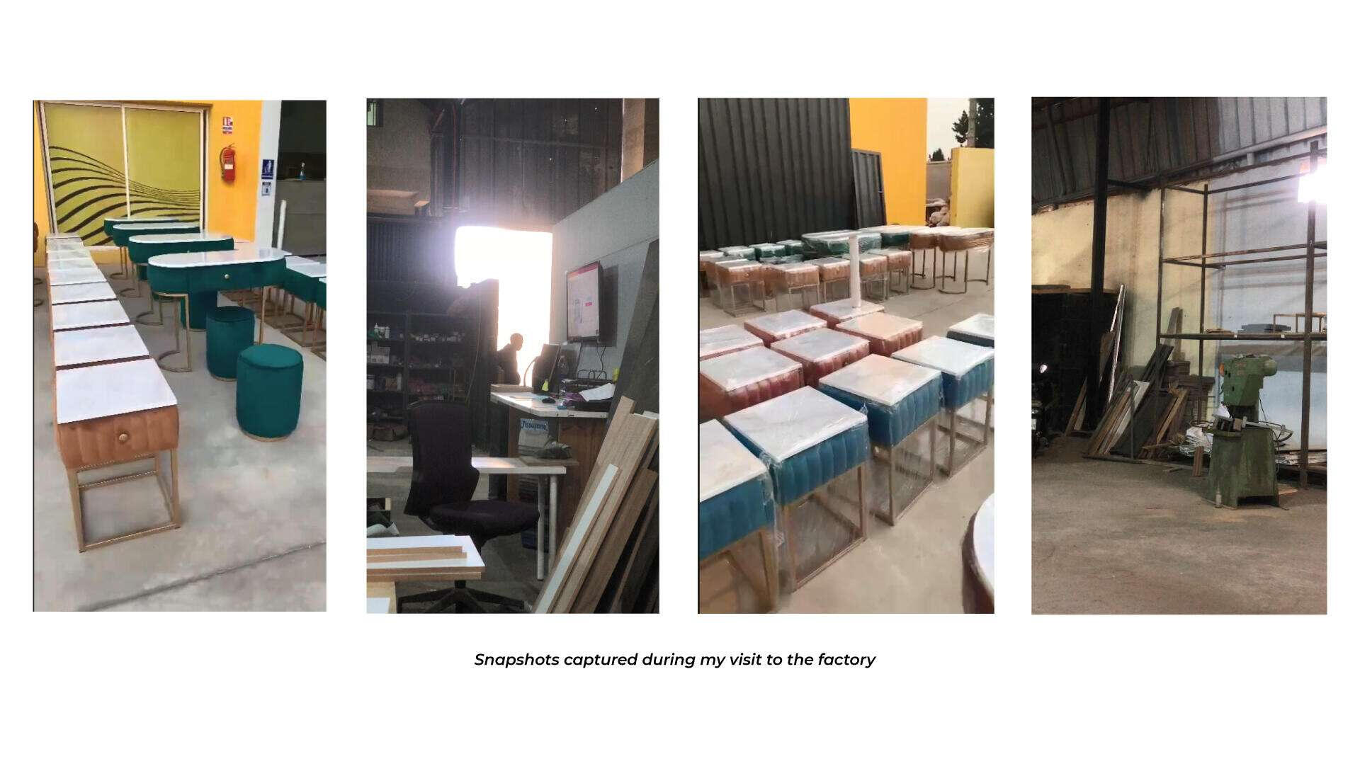
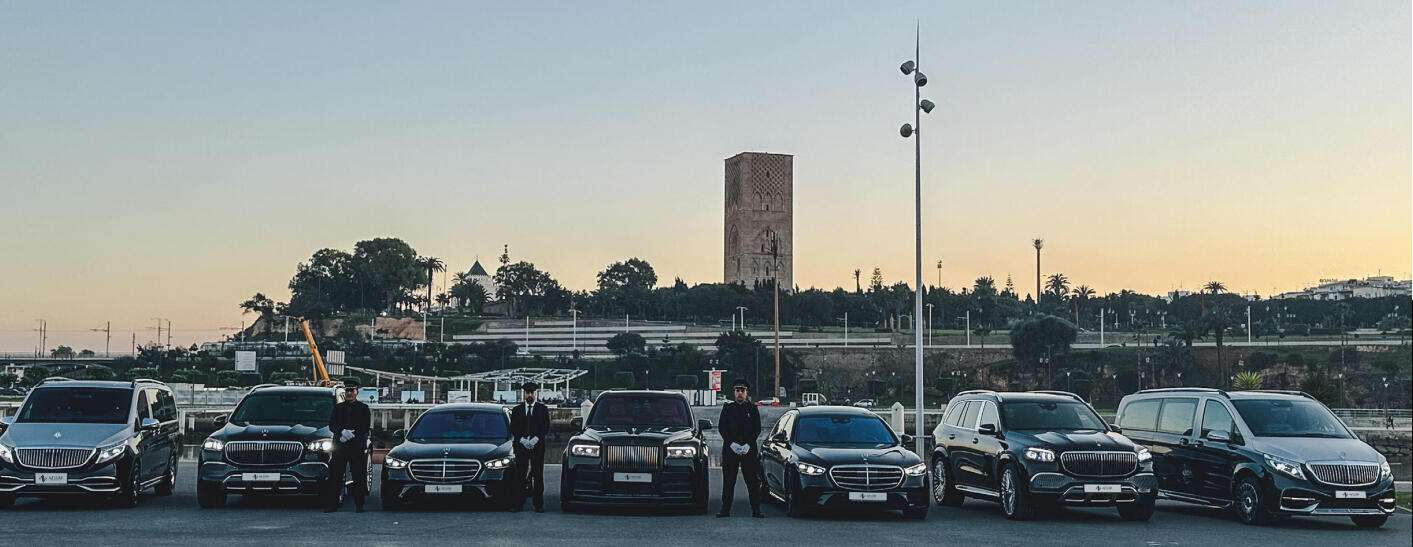
Back in December 2022, a friend who runs a communication agency reached out with a challenge. He needed an Art Director for a high-end car rental photo shoot. He told me everything was ready; the photographers were booked and the brief was set. He just needed someone to step in and ensure the creative vision was executed perfectly.I didn't hesitate. "I'm in," I said. "Where is it?"He told me the shoot was in Rabat and that we would be handling about 20 luxury vehicles. Now, I will be honest: I had never worked on a project of this scale before. I felt that familiar spark of nerves, but I knew that once you get into the "flow," the work takes over. However, my jaw dropped when he told me the lineup: we were not just shooting cars; we were shooting Lamborghinis, Maybachs, and Rolls-Royces.I laughed and told him, "Bro, I have never even touched one of these, and now I am responsible for how they look on camera?" But I love a challenge, and I was ready to dive in.The Vision vs. Reality
I spent the following days obsessing over moodboards and preparations. I had a clear vision for the location and the lighting. Since I was told we had "car photography professionals" on board, I focused entirely on the creative direction and the shot list.Then came the day of the shoot. I drove from Casablanca to Rabat, arrived at the location, and found absolutely nobody.I called my friend, and that is when the "logistical nightmare" started. The location had been changed at the very last second because the cars needed to stay close to the client’s showroom. My heart sank. I had planned every shot based on the lighting and ambiance of the original spot. I knew nothing about this new location, and to make matters worse, it was a bright, harsh sunny day, which is a photographer's toughest challenge.Here's a part of the Moodboard I prepared
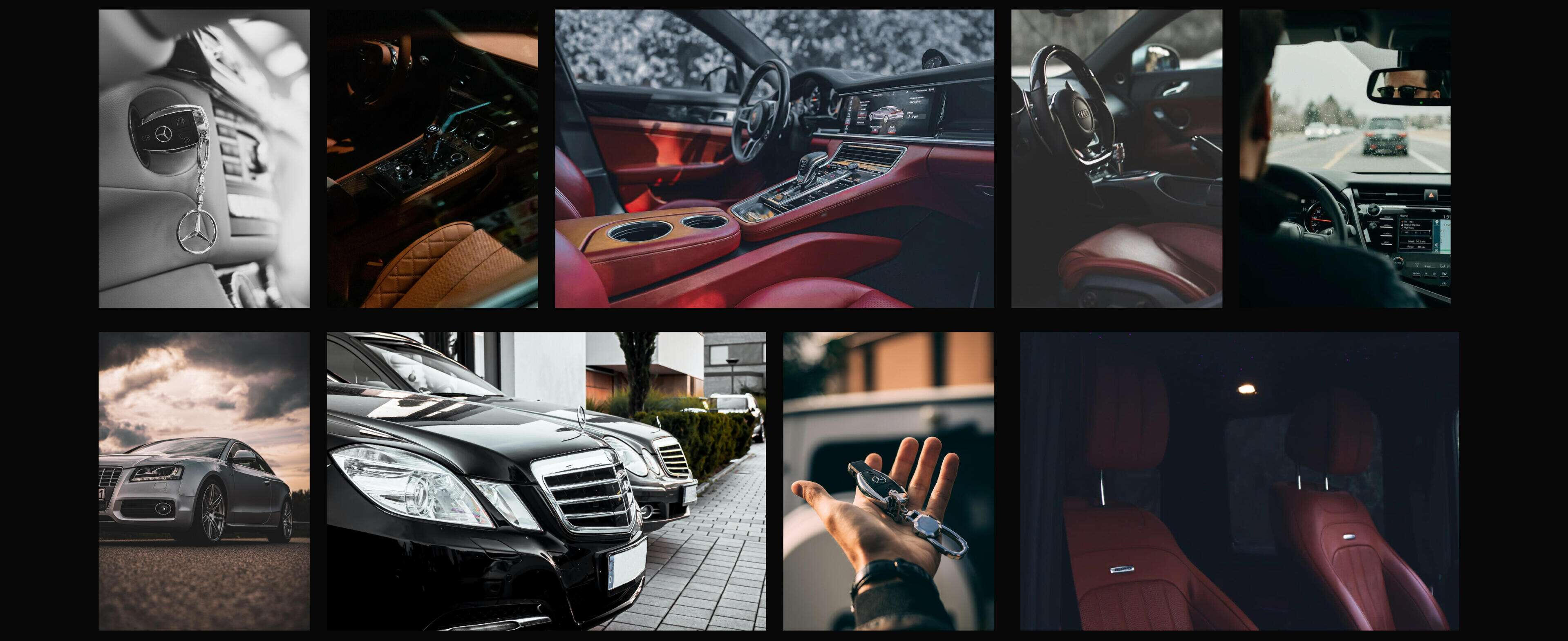
Higher Difficulty Mode
When I arrived at the new spot, it was even more chaotic than I imagined. It was a crowded public area in Rabat. What was supposed to be a controlled photo shoot was turning into a public car show. I am someone who gets stressed in big crowds, but I told myself: "This will make a great story if we pull it off."Then came the final blow: the project manager told me we only had a few hours, we only had one photographer, and we had to finish before the area got too packed. It felt like I was playing a video game and someone had just bumped the difficulty setting to "Extreme."When I finally met the photographer, I realized our artistic styles were not aligned. Because we had not communicated beforehand, his approach did not match the high-end vision I had built for the brand. I had to improvise, and fast.The Pivot: iPhone to the Rescue
I decided to take matters into my own hands. I had recently picked up the iPhone 14 Pro, which had just been released. I figured I would use it to capture "backups" to ensure I got the exact shots I envisioned in my brief.As soon as I started working with the cars, the stress evaporated. It is hard to stay stressed when you are surrounded by Maybachs, a Keyvany-modified Rolls-Royce Cullinan, and Lamborghini Uruses. I spent the next few hours fully immersed, capturing these ultra-luxury machines on my phone while navigating the crowds of spectators.The Result
In the end, the "spectacle" worked in our favor. We adapted to the environment, and the energy of the location added something special to the day.When we got to post-production, the surprise was even bigger: the shots I took on the iPhone 14 Pro were stunning. In fact, many of them were sharper and better composed than the ones from the professional DSLR. By combining the best of both worlds, we delivered a final result that the client absolutely loved. They ended up using the imagery across their entire digital ecosystem, from their website and app to their official catalogues.Here are a few of the final shots from that day
The Lesson
This experience taught me one vital thing: Stay present. No matter how big the challenge or how much the plan falls apart, you have to stay calm and trust the process. If you stay focused on the end result rather than the obstacles, everything eventually falls into place.
In Action
Here is a short video featuring some highlights from the shoot. You can see how focused I was and how much I was in the flow of the project. I also want to give a special shoutout to the amazing team. From the photographer to the drivers and project managers, I am grateful for their collaboration. Their trust in my vision is what truly brought this beautiful project to life.
Work
My work spans branding, art direction, and visual systems, and I’ve had the opportunity to collaborate with different teams, cultures, and markets.You will find a selection of projects I’ve truly enjoyed working on, across branding, art direction, and visual systems.
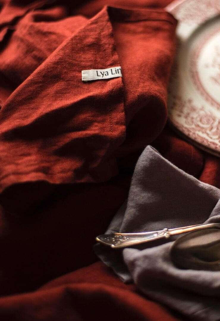
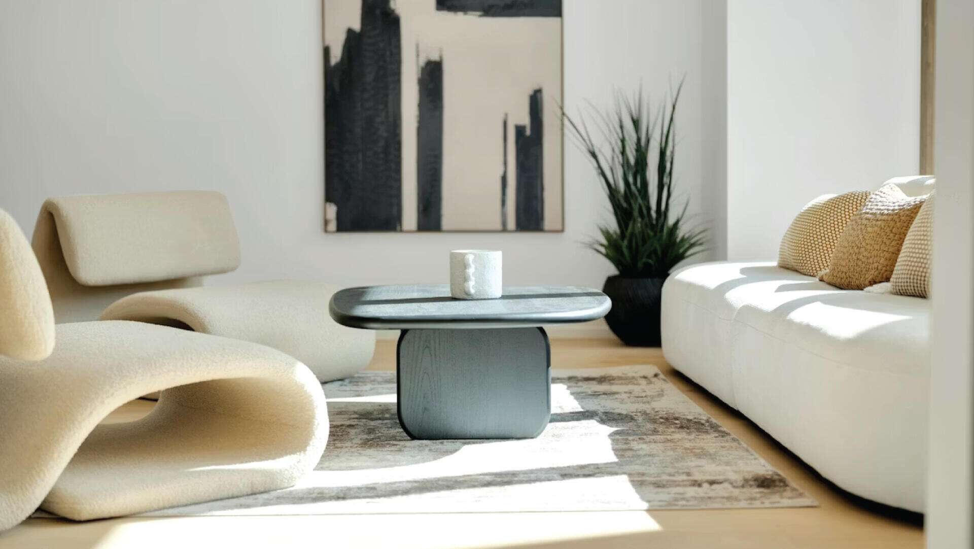
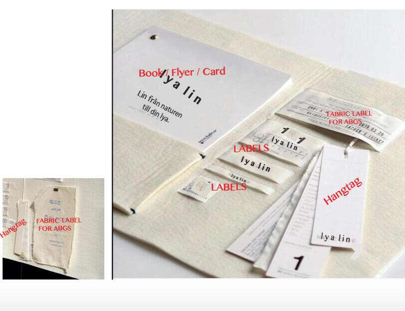
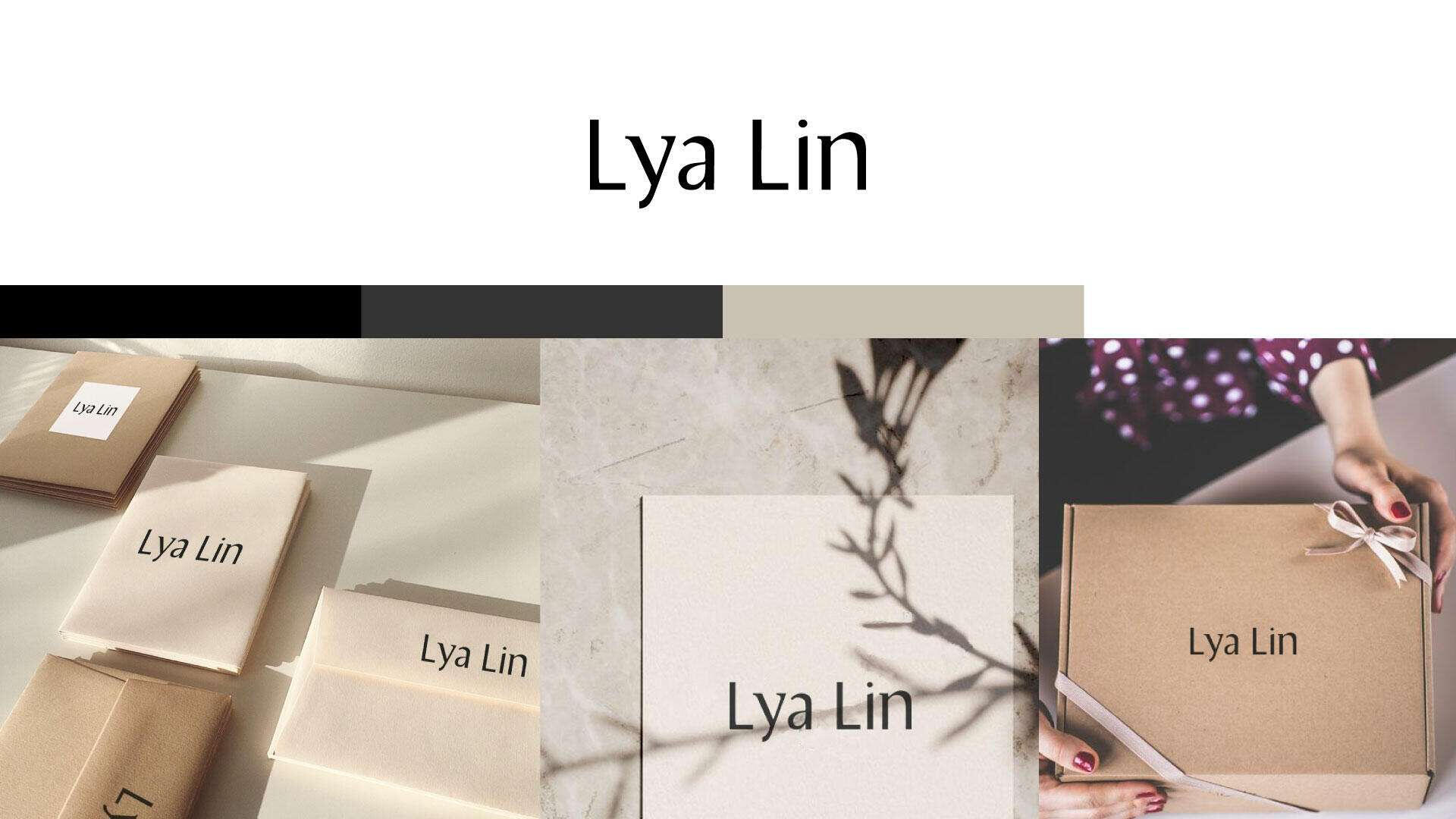
Lya Lin - Branding
Lya Lin is a textile shop from sweden that offers bed linens, tablecloths, and linen products designed to add elegance and comfort to every room of the home.My mission for this project was to develop a visual system that aligns with the brand’s vision and communicates its essence with clarity and beauty.
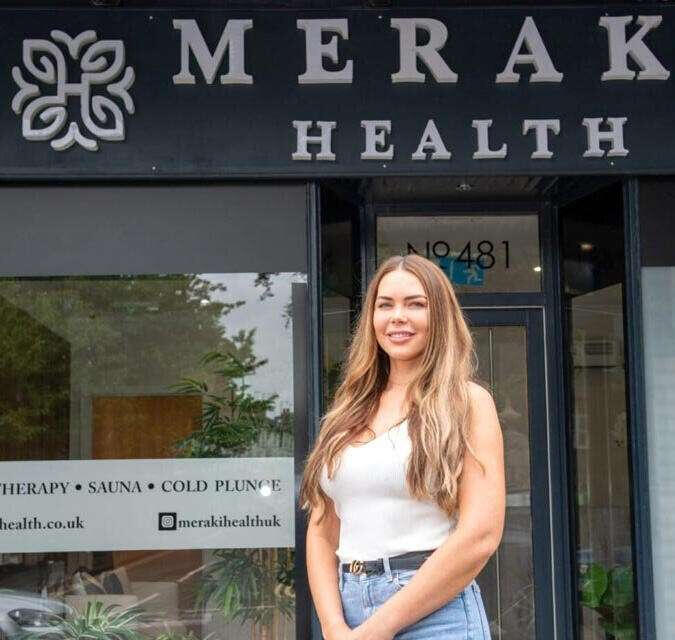
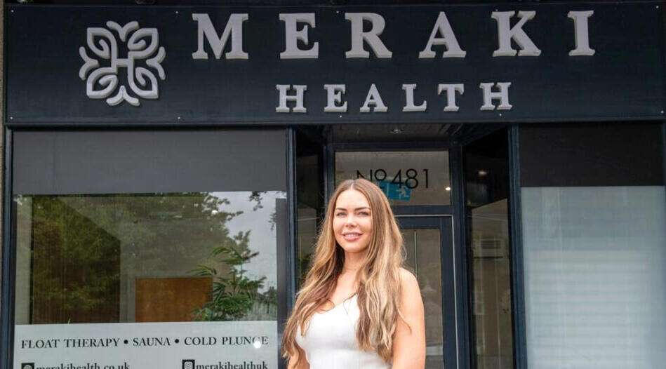
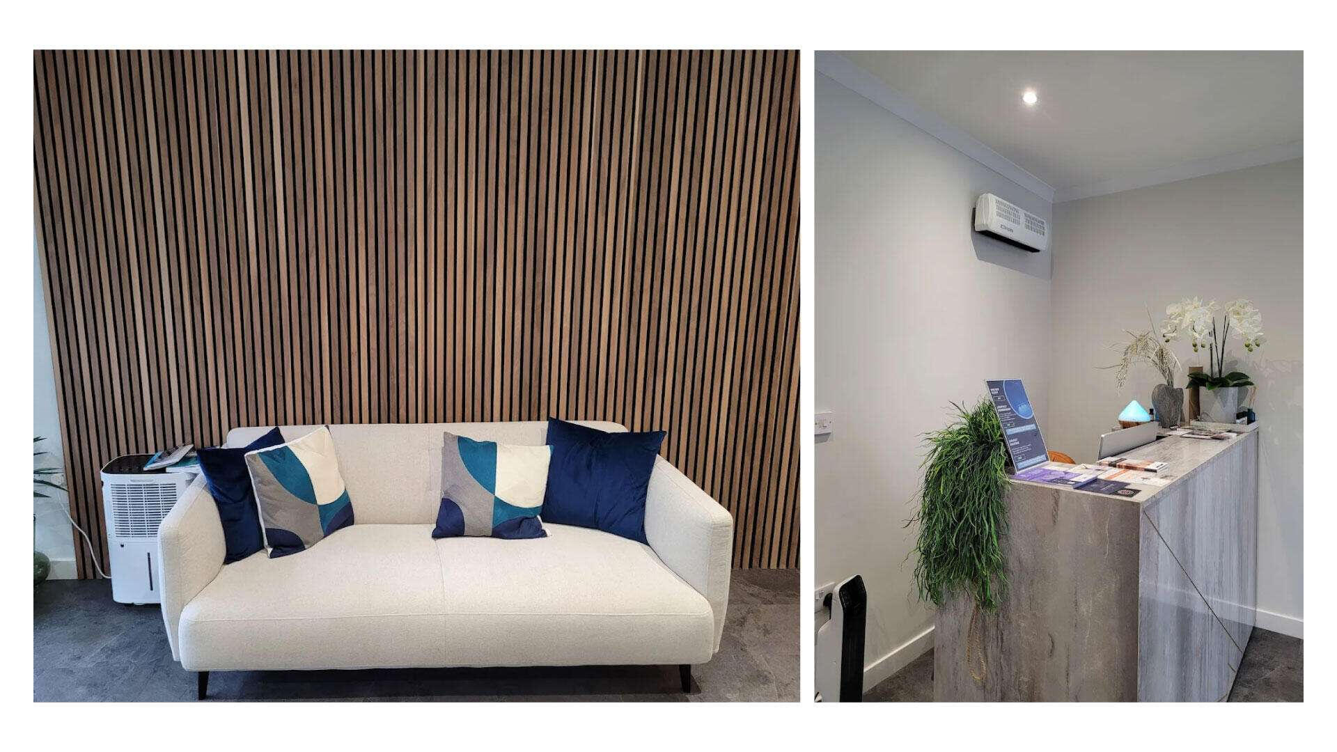
Meraki Health - Branding
Meraki Health UK is a wellness brand dedicated to helping individuals restore balance through holistic therapies, including floatation, contrast therapy, and health coaching. With locations in Scotland and Hertfordshire, Meraki Health blends science and mindfulness to support physical recovery, mental clarity, and long-term well-being.
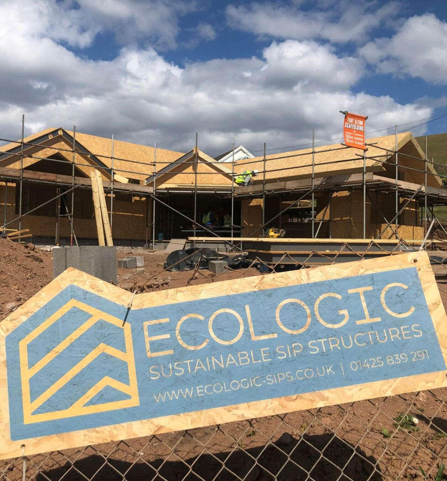
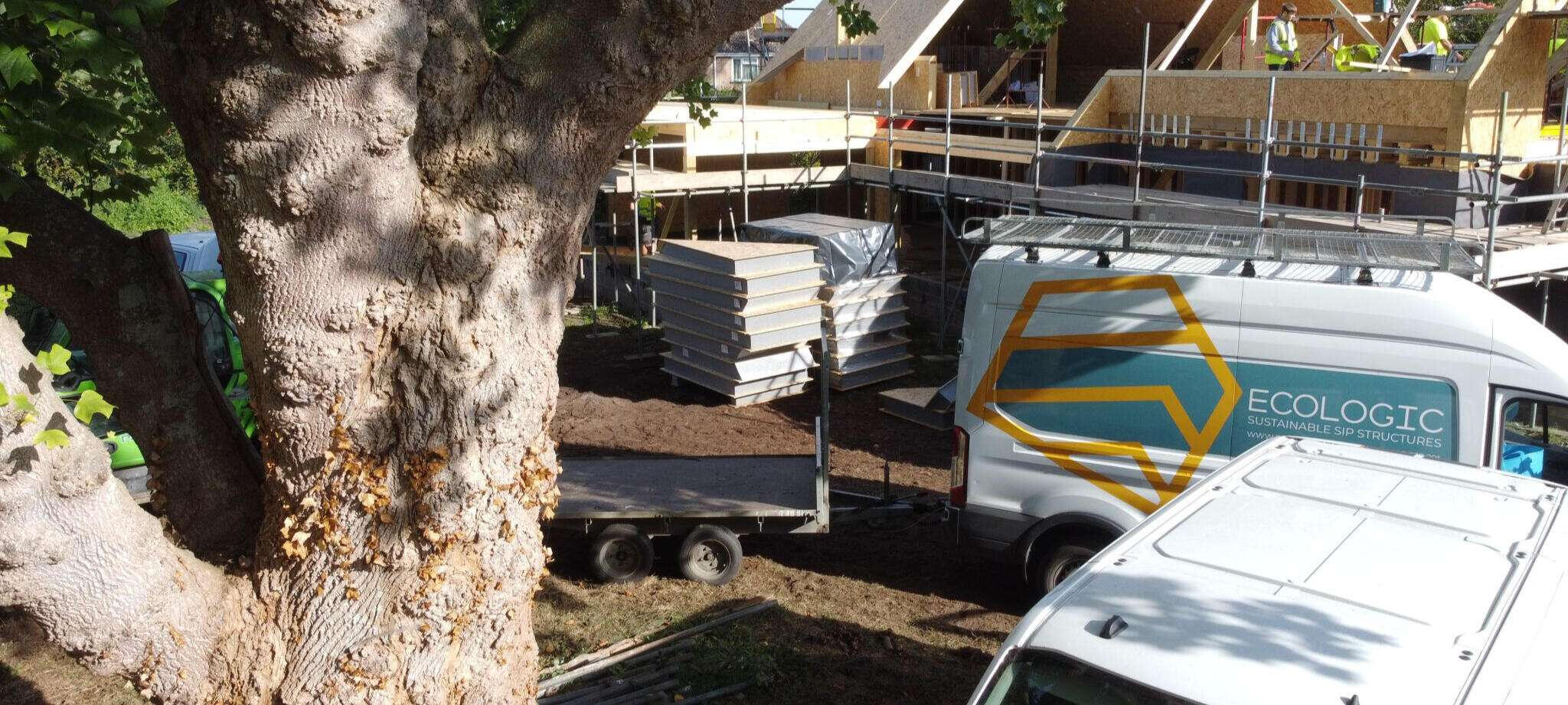
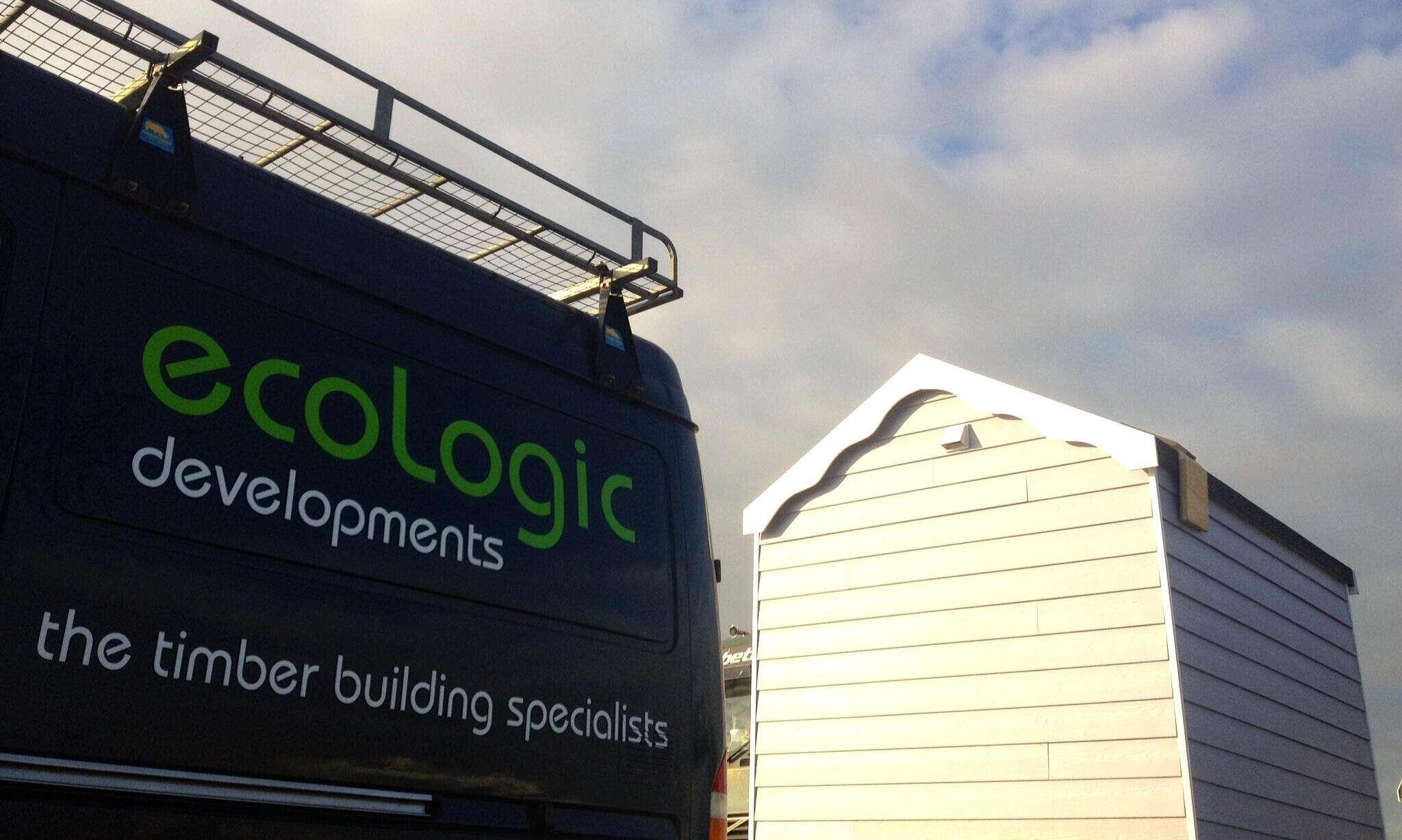
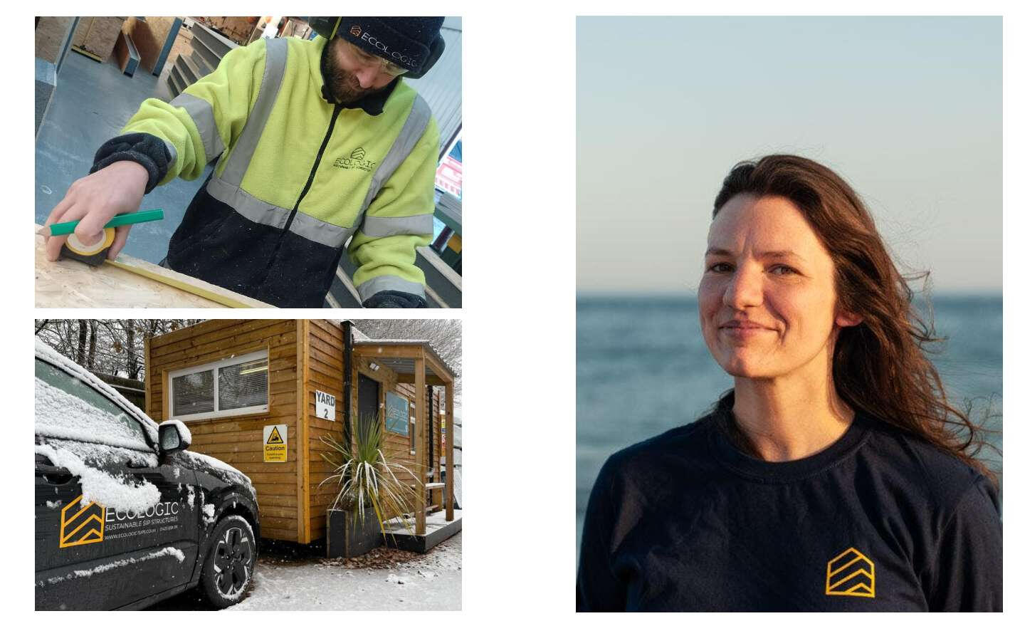
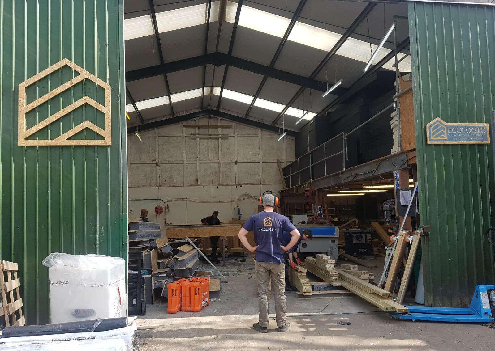
ecologic sips - Branding
Ecologic SIPs is a UK-based company that designs, manufactures, and installs high-performance Structural Insulated Panels (SIPs). With over 20 years of experience, they create sustainable, design-led buildings, ranging from eco homes to luxury lodges, using low-impact, energy-efficient construction methods.
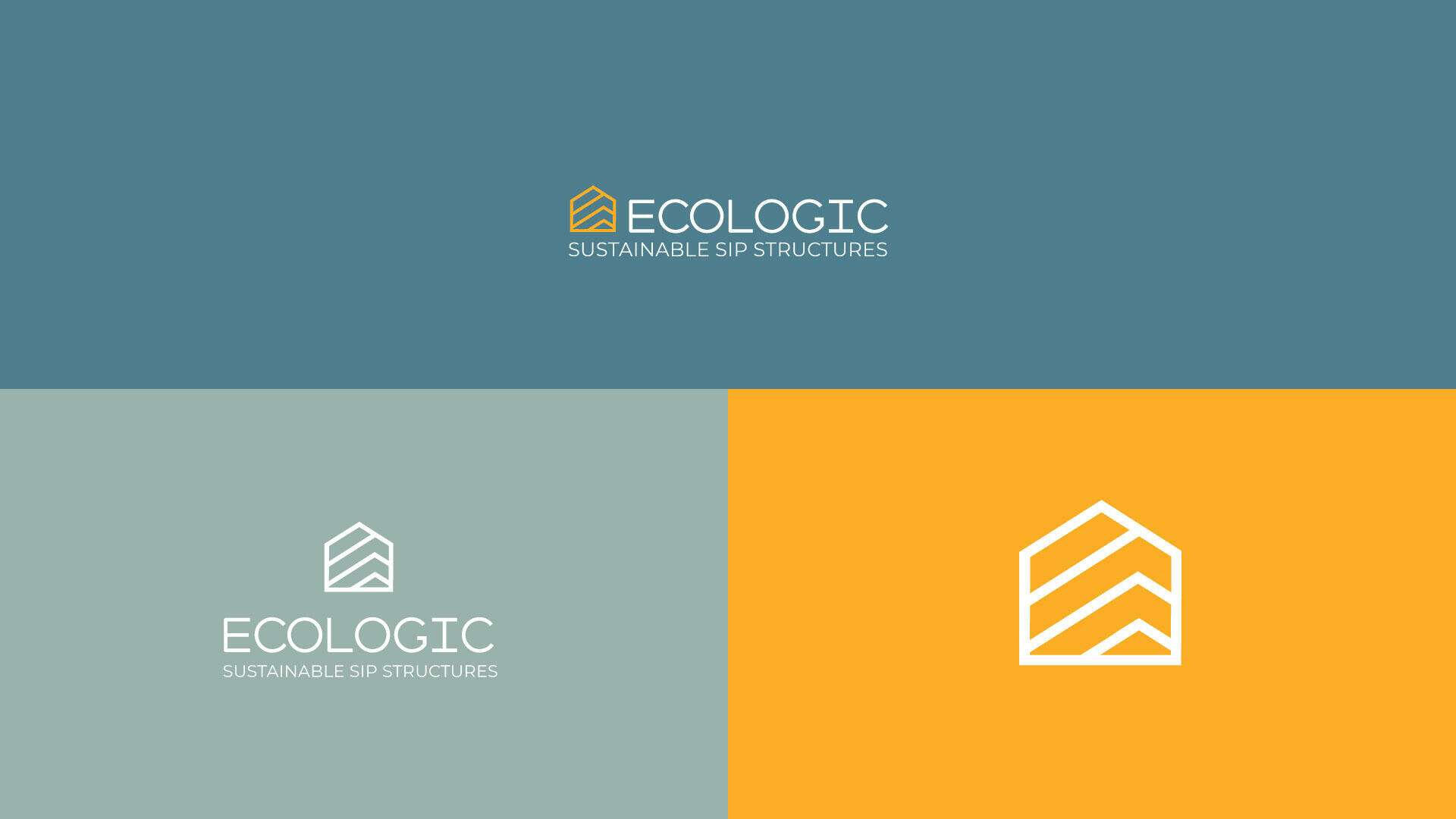
Ecologic - Rebranding Case Study
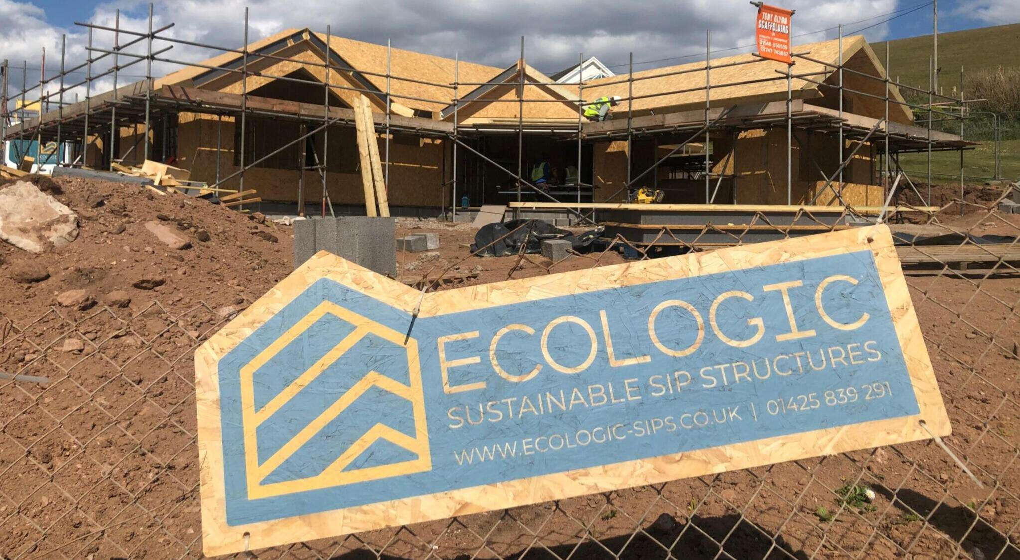
Ecologic SIPs is a UK‑based specialist in designing, manufacturing, and installing Structural Insulated Panels (SIPs) from their workshop in the New Forest, Dorset. For over 20 years, they’ve championed high‑quality, eco‑friendly construction, creating modular, design‑led homes like luxury beach lodges, garden annexes, and clifftop residences.Core Vision & Values
They aim to empower homebuilders and industry professionals to create design‑led, eco‑buildings using sustainably sourced materials and low‑impact methods. Guided by Care, Inspire, and Craft, they prioritise resource efficiency, airtightness, zero cold-bridging, and energy‑efficient solutions often integrating MVHR ventilation, triple glazing, and renewable PV options.In this project, my mission was to rebrand Ecologic SIPs, transitioning them from their previous market to a new audience with a different set of products and services.
Ecologic previously had a logo and visual identity that represented their original business model. But when that model changed, it no longer felt like a good fit for them.
That’s why a rebrand was necessary, they started communicating with a different type of client and entered a new market.
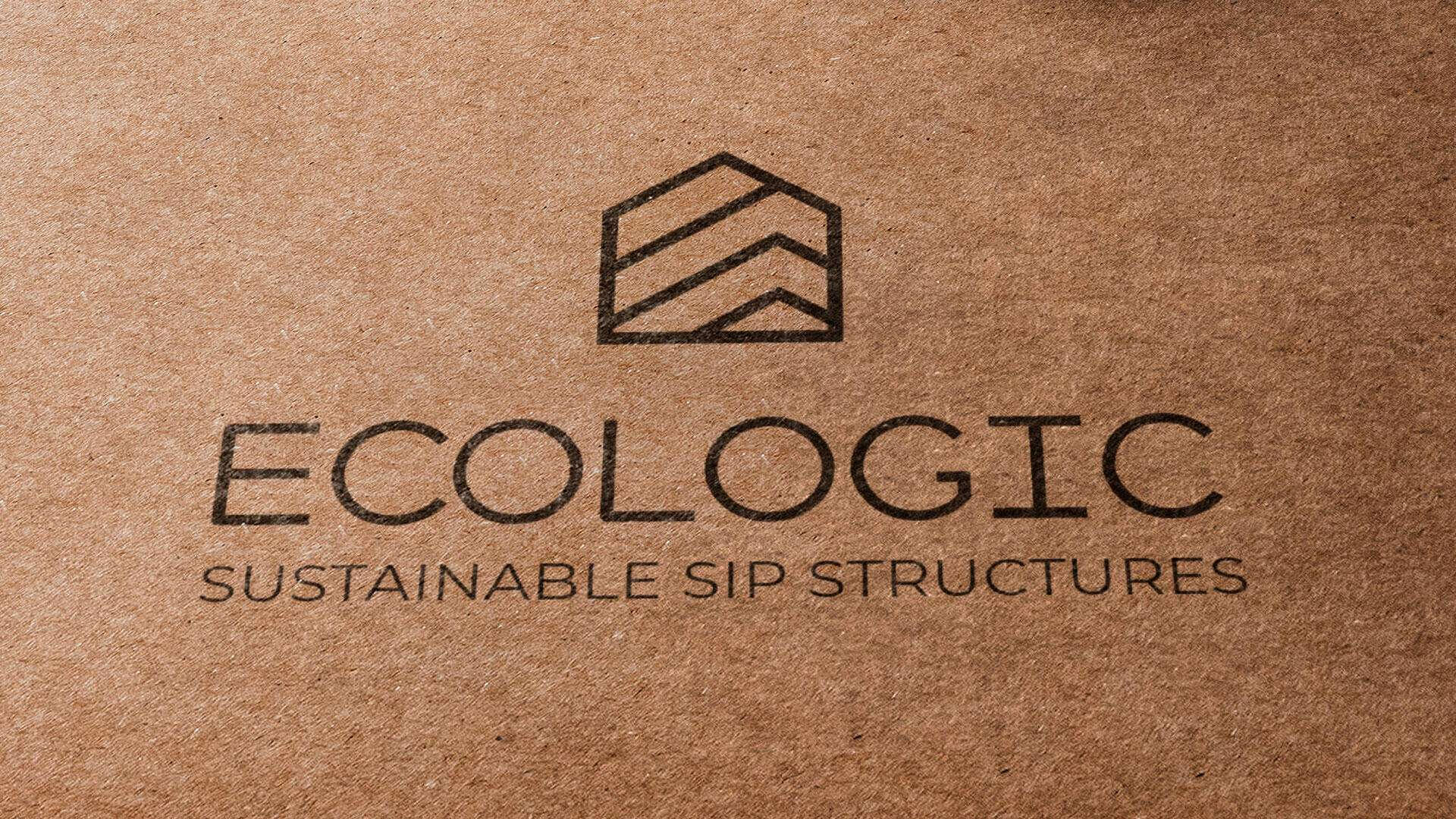
And this is what their old logo used to look like.
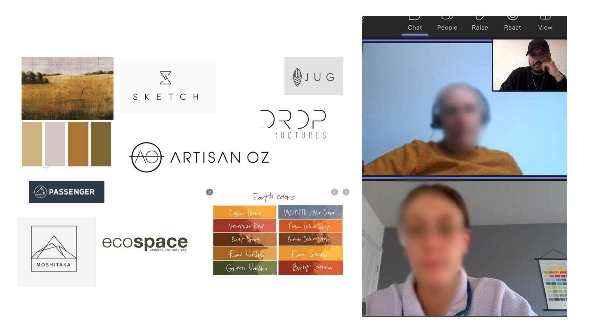
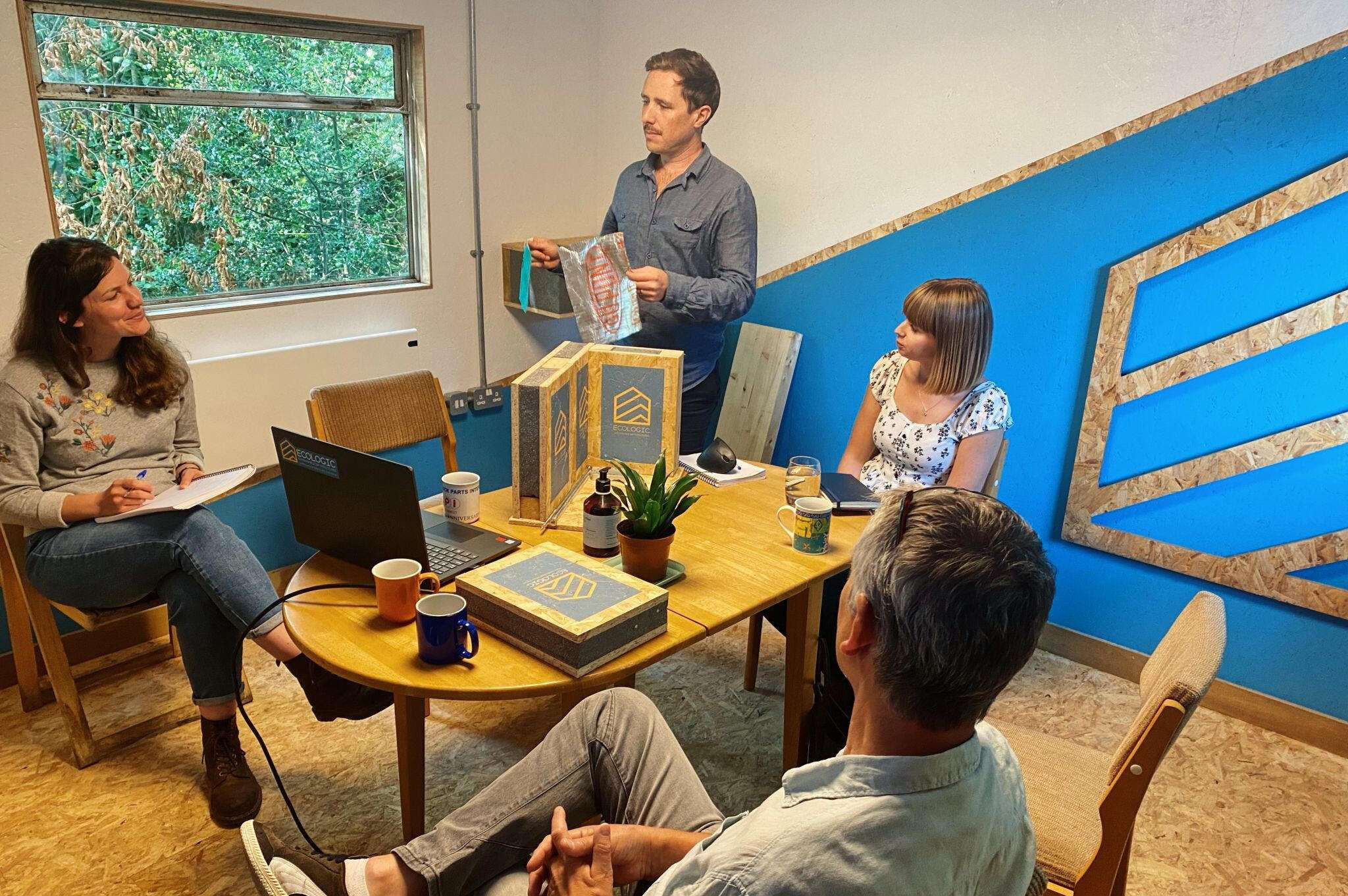
So the goal was to create a new identity that fits the new direction. And like with any project, we start with a strategy session where we define all the objectives and everything we need to work on to get the best possible result.One of the most important steps after setting the strategy is to study the environments where the branding will appear in a physical sense.
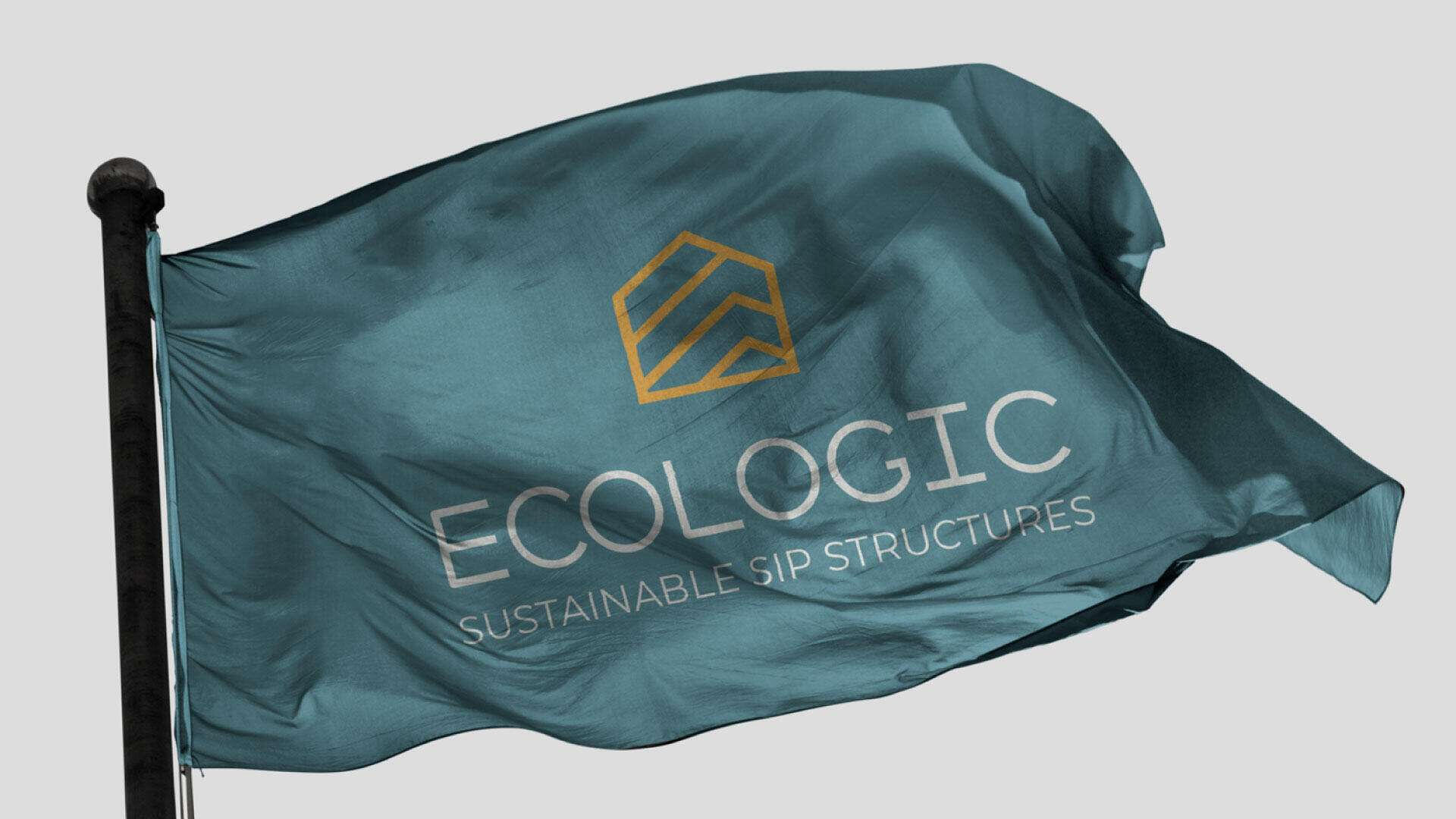
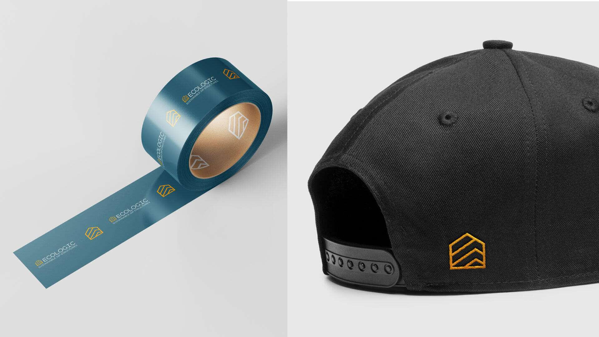
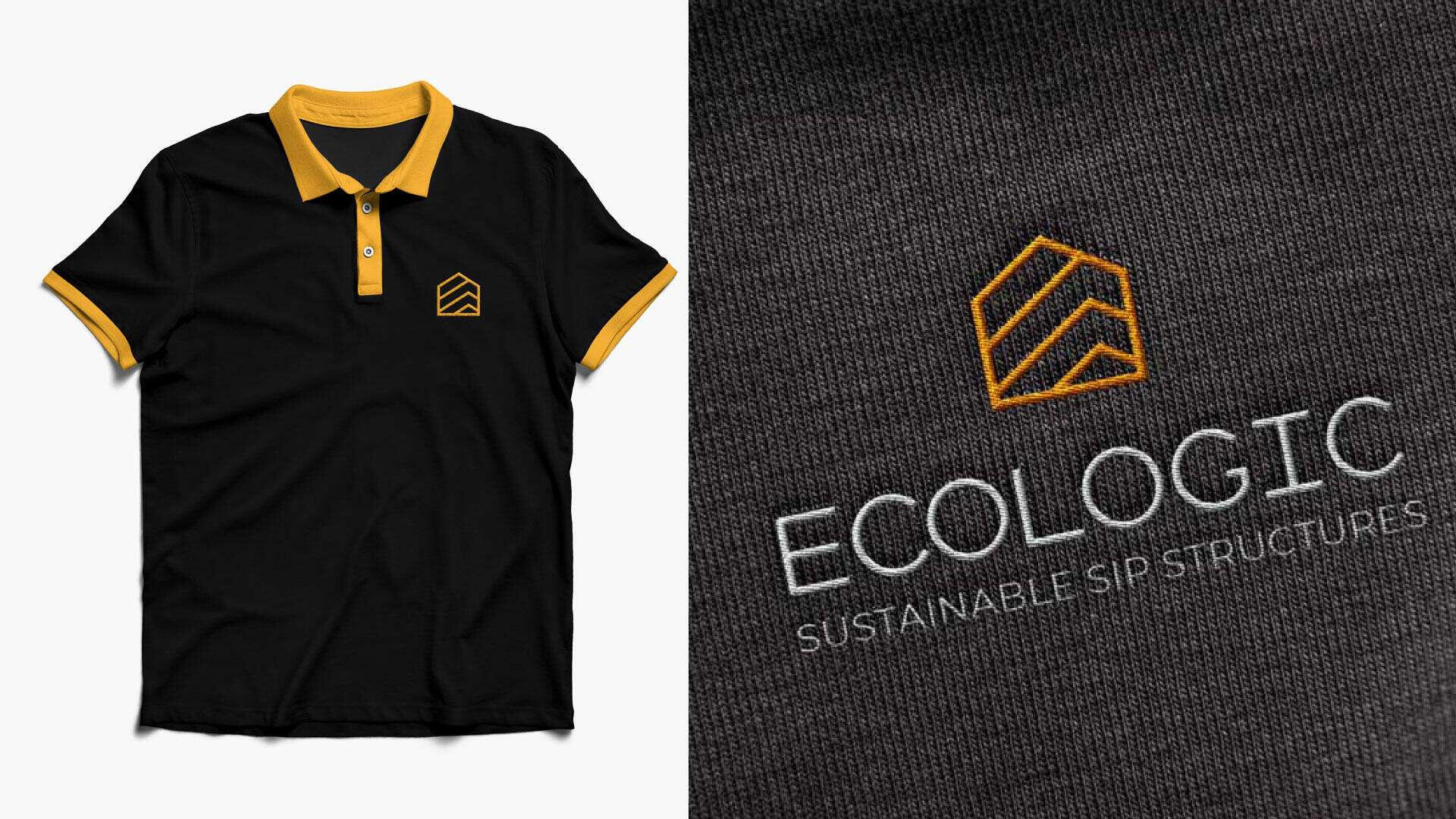
We found that the visual branding would show up across a lot of materials and textures—like wood, uniforms, equipment, stickers, and so on.Once we’re done with that phase, we move on to building a moodboard to inspire us and help guide the creative direction.
After defining the moodboard and setting a fitting art and creative direction, we moved on to the concept development phase.In construction-focused companies, it’s common practice to display their logo at the worksite so people know which company is handling the project.
That’s why the logo needed to be expressive, it should reflect the nature of the company's activity. At the same time, we had to consider other environments where the branding would appear, like digital platforms and product packaging.Of course, all of this had to respect core design principles: the logo had to be simple, unique, and not overloaded with details, so it could be easily applied across different mediums.Our main creative idea for the logo was to work with an icon that represents the essence of their work. But we also explored other directions, like abstract forms or playing with the first letter of the brand’s name.We put all these ideas into sketches and began working on the first draft.
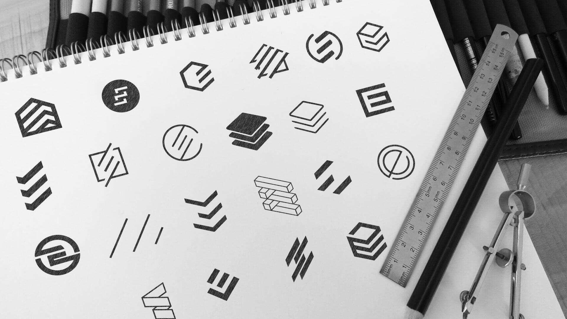
So after we created the first sketches, we selected the icon that stood out the most and that the whole team agreed on.
Then we moved on to the next step, which was testing that chosen icon with different fonts. We also explored various thickness options to find the right balance between shape and typography, making sure the final combination felt just right.
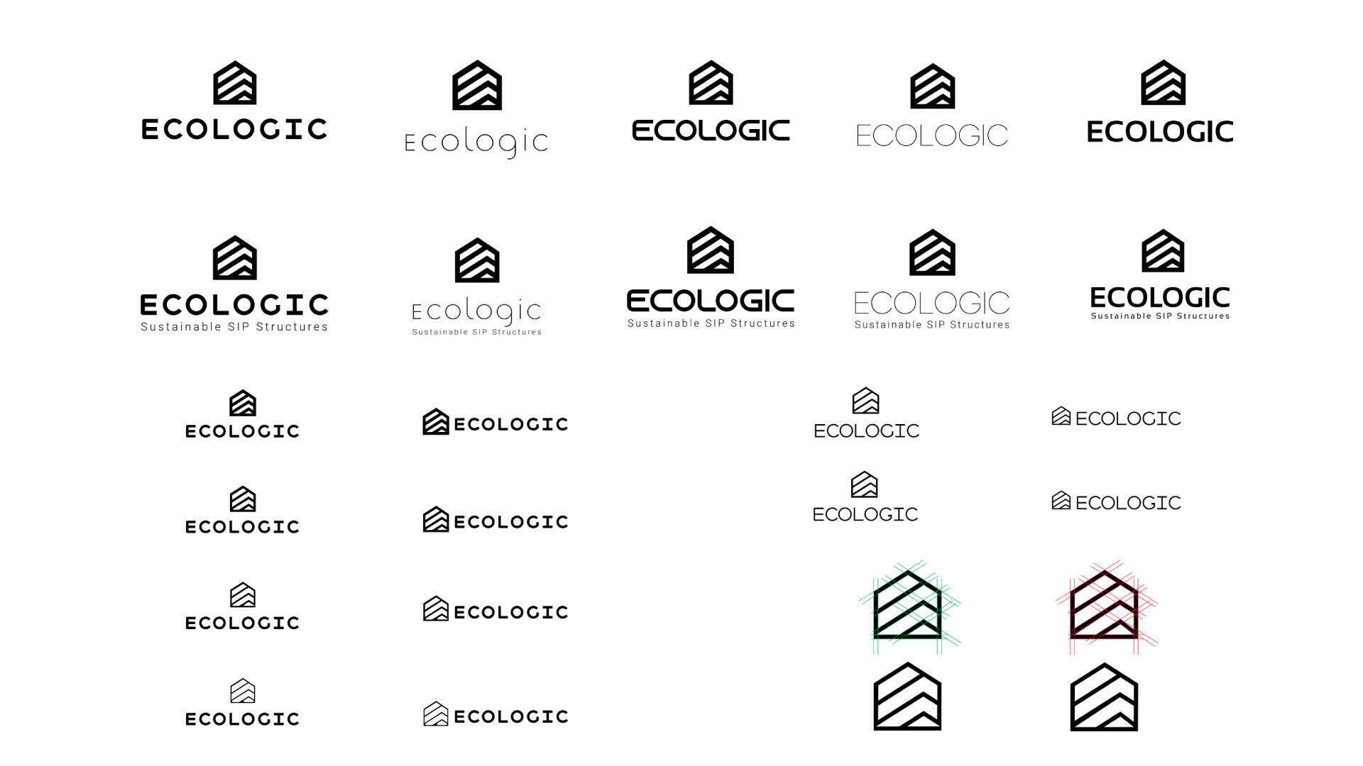
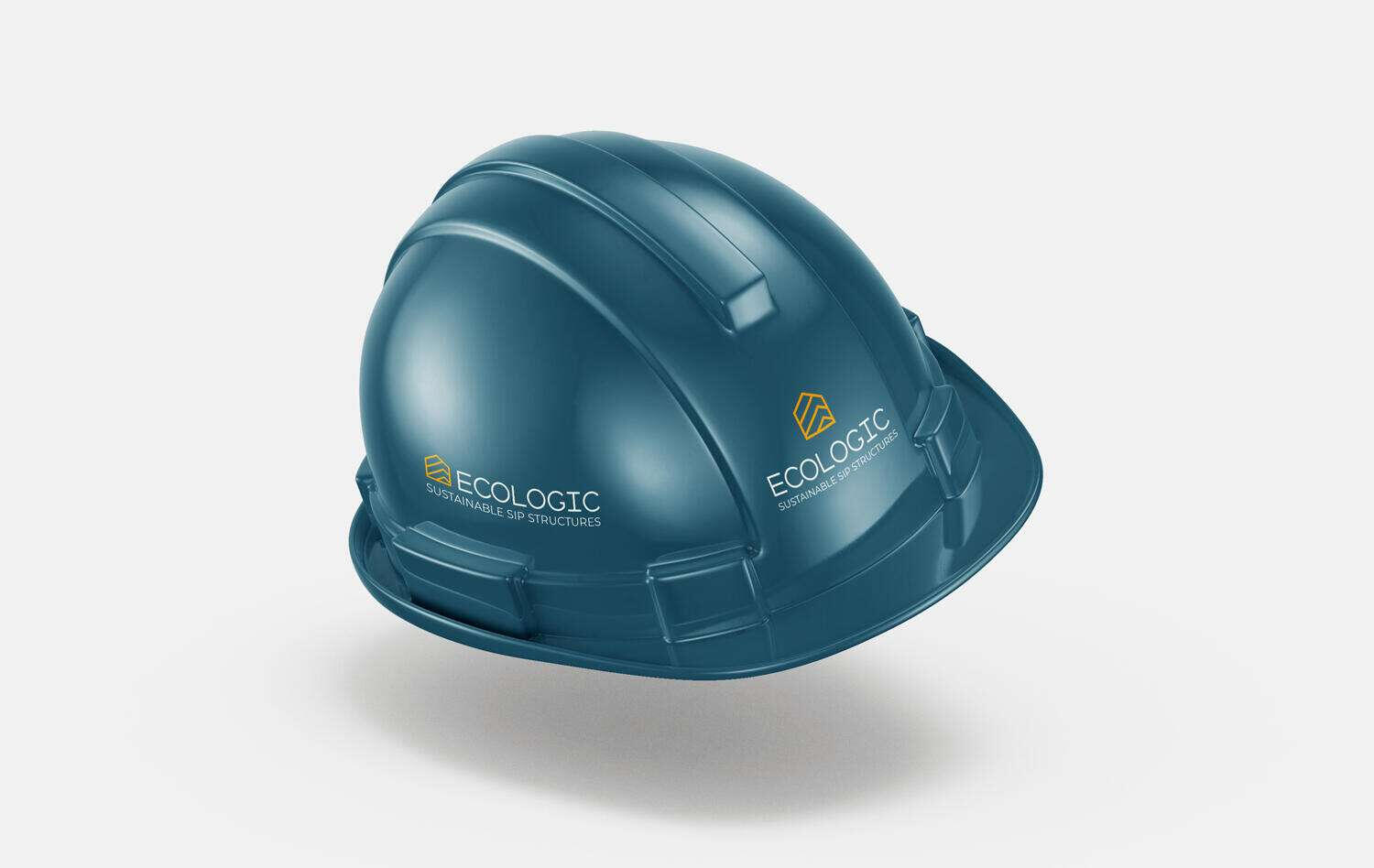
After we locked in the right icon with the right font, the next step was to choose a color palette and test everything through mockups.
In the end, we selected the option that looked the best, one that everyone agreed on as the strongest and most fitting direction. That option became the new visual image of the brand.As for the mockups, it was essential to test the selected designs across all the environments we identified in the initial phase.
We needed to explore as many realistic mockup scenarios as possible before moving to the final presentation, ensuring that the design worked well in every context and gave us a clear, accurate picture of how it would perform in the real world.
Here are a few examples we explored.
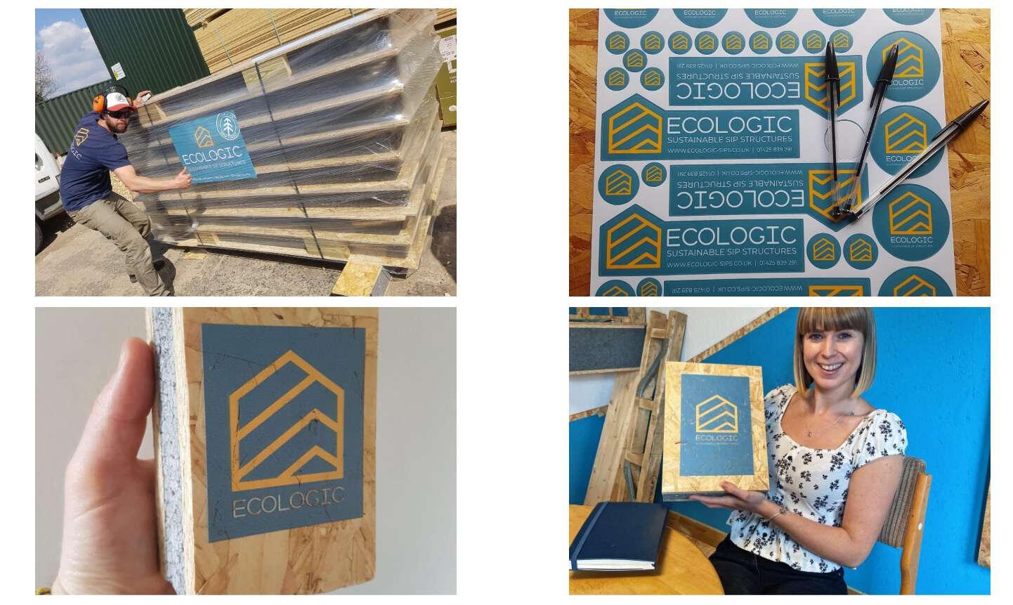
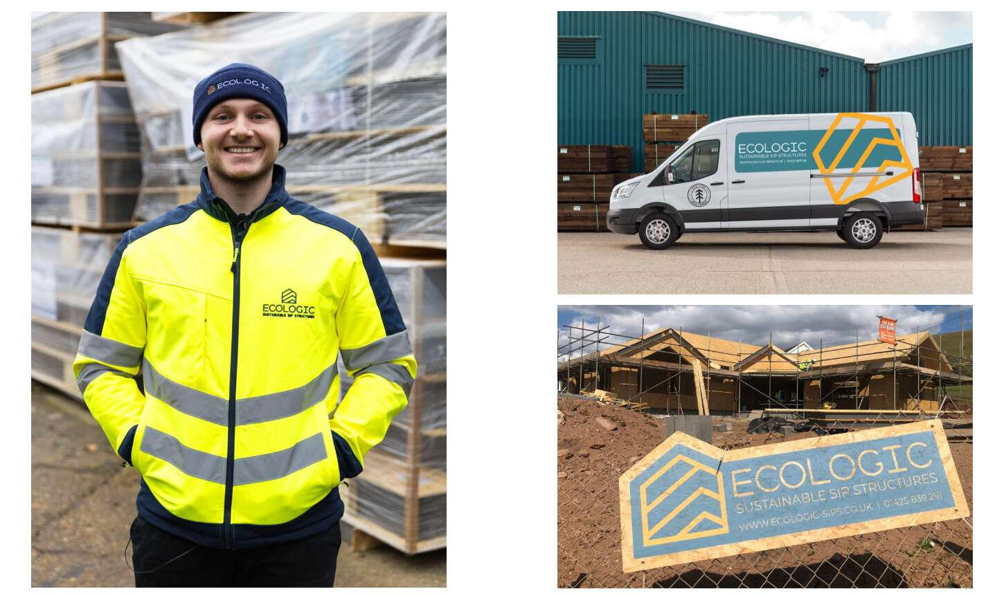
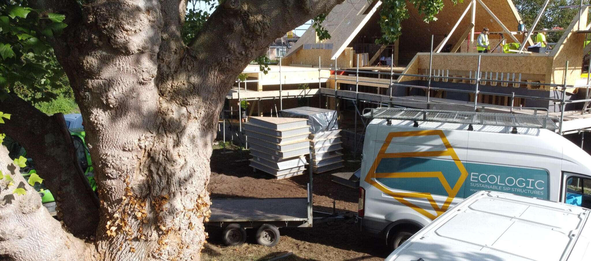
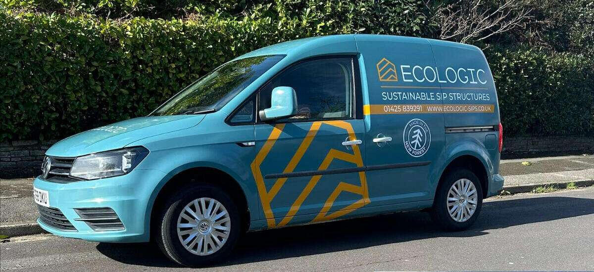
Once we were confident that the logo and visual identity would perform well across all the environments we worked on, we were ready to move into the final phase, seeing everything come to life in the real world.
Thankfully, everyone was happy with the result and proud of the new identity.And after years of working with this new visual identity, these were the real-world outcomes.
Sustainability First
The Ecologic project was truly a pleasure to work on, not just because it was a branding job, but because it was built on values that matter.
The people behind it genuinely care about nature and the planet, and that’s something worth respecting and supporting.It’s hard not to admire brands that stand for something bigger than just profit, brands driven by purpose and vision.You can see how Ecologic’s transformation came to life in the real world.
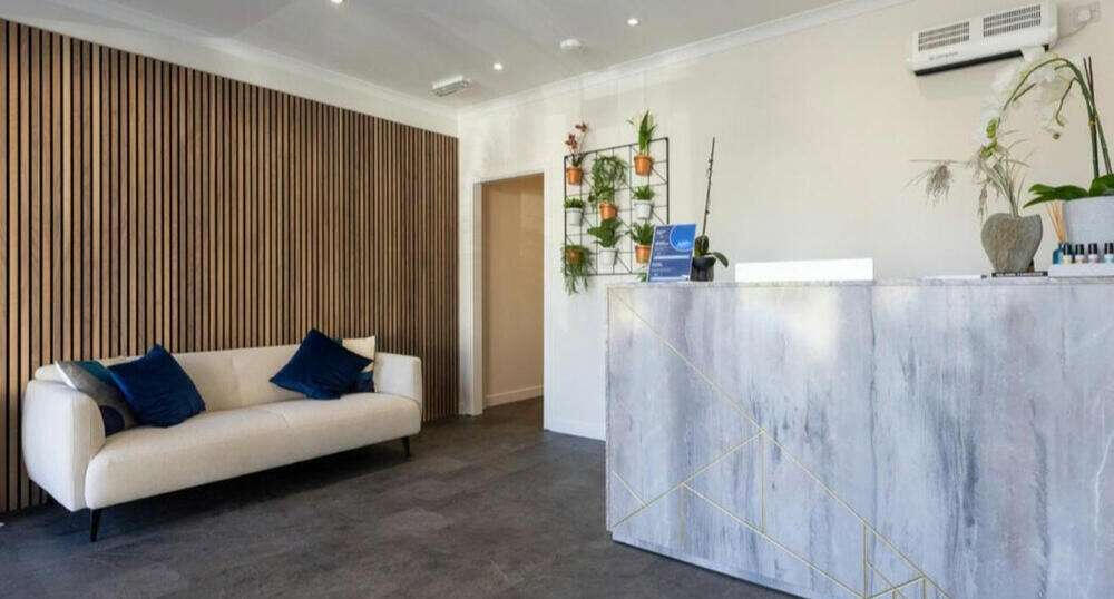
Meraki Health - Brand Design Case Study
Meraki Health UK is a modern wellness studio based in Aberdeen, UK, offering science-backed recovery and relaxation experiences through private floatation therapy, Finnish-style sauna, cold plunge, and contrast therapy. Their mission is to help individuals reset their mind and body in a calm, restorative environment just minutes from the city centre.As a premium health and wellness brand, Meraki Health stands out for its commitment to evidence-based therapies, minimalist design, and client-centered experience. Their approach combines ancient healing methods with modern science to support physical recovery, stress resilience, and long-term well-being.My main mission in this project was to create a visual system that reflects the brand’s vision and values—
which can be summed up in the following keywords:
premium – health and wellness – healing – therapy – minimalist – client-centered experience.Every design choice was guided by these core principles to ensure the visual identity feels aligned with what the brand stands for.
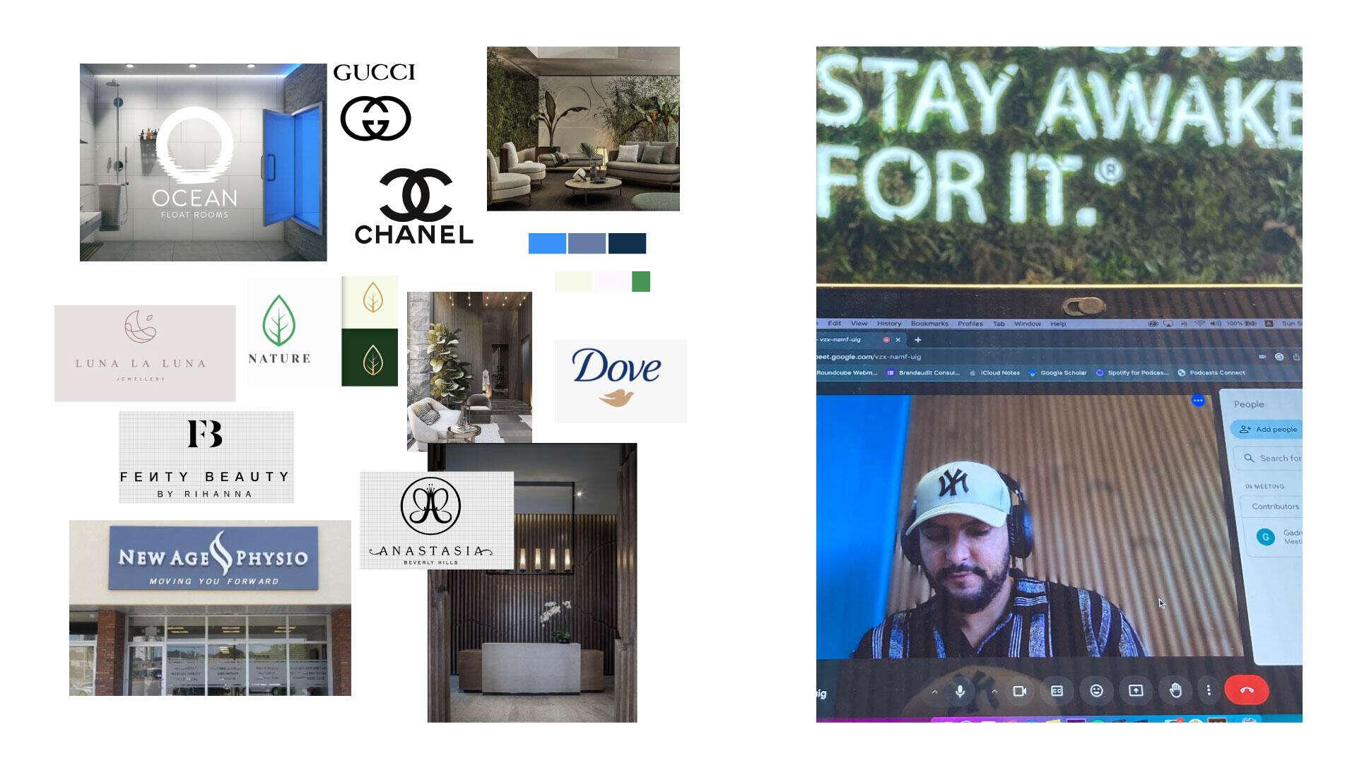
As always, the workflow starts with a strategy call where we define all the goals and analyze all the inputs we have, like the brand’s objectives and vision, the environment where the branding will live,
and what art direction would best suit the visual system.From there, we build a moodboard that gives us a clear sense of the right feel and vibe before moving into execution.
Most importantly, it also helps us identify the core challenge, so that our design isn’t just visually appealing, but also acts as a strategic solution to that challenge.
Once we’ve defined the goals and clearly identified the challenge, we move on to the sketching phase where we explore our ideas and evaluate which direction works best.The initial idea we discussed with the client was to create a monogram logo using the brand’s initials.
However, we also asked ourselves: why not explore an alternative direction, like an abstract icon that visually expresses wellness and relaxation?The font paired with the logo needed to reflect the keywords and brand attributes we had previously defined, with the full logo conveying a strong premium feel, enhanced by a calming, wellness-oriented vibe.
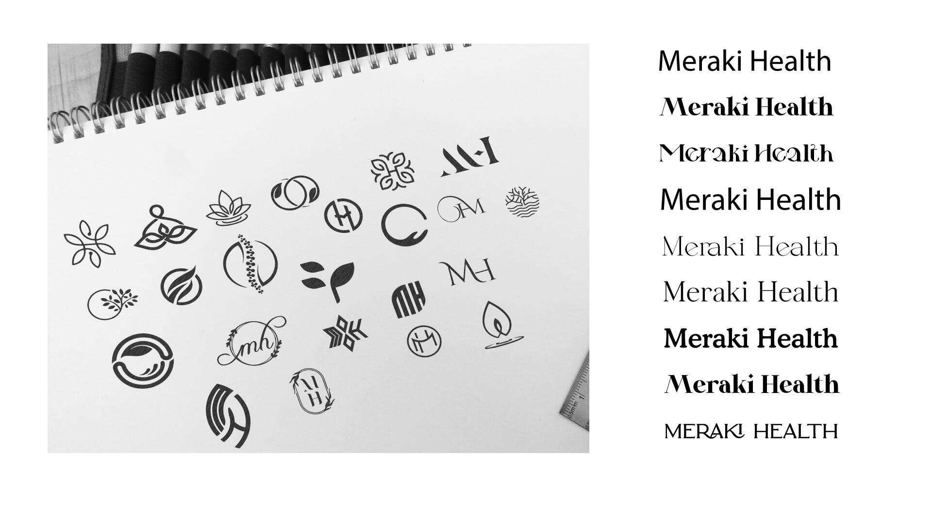
After laying out all the ideas and exploring the different possibilities, we finally chose one direction to move forward with as the first draft.We then tested it through mockups to see how it performs in real-world contexts and to evaluate whether it truly feels right and aligns with the brand’s goals and emotional tone.
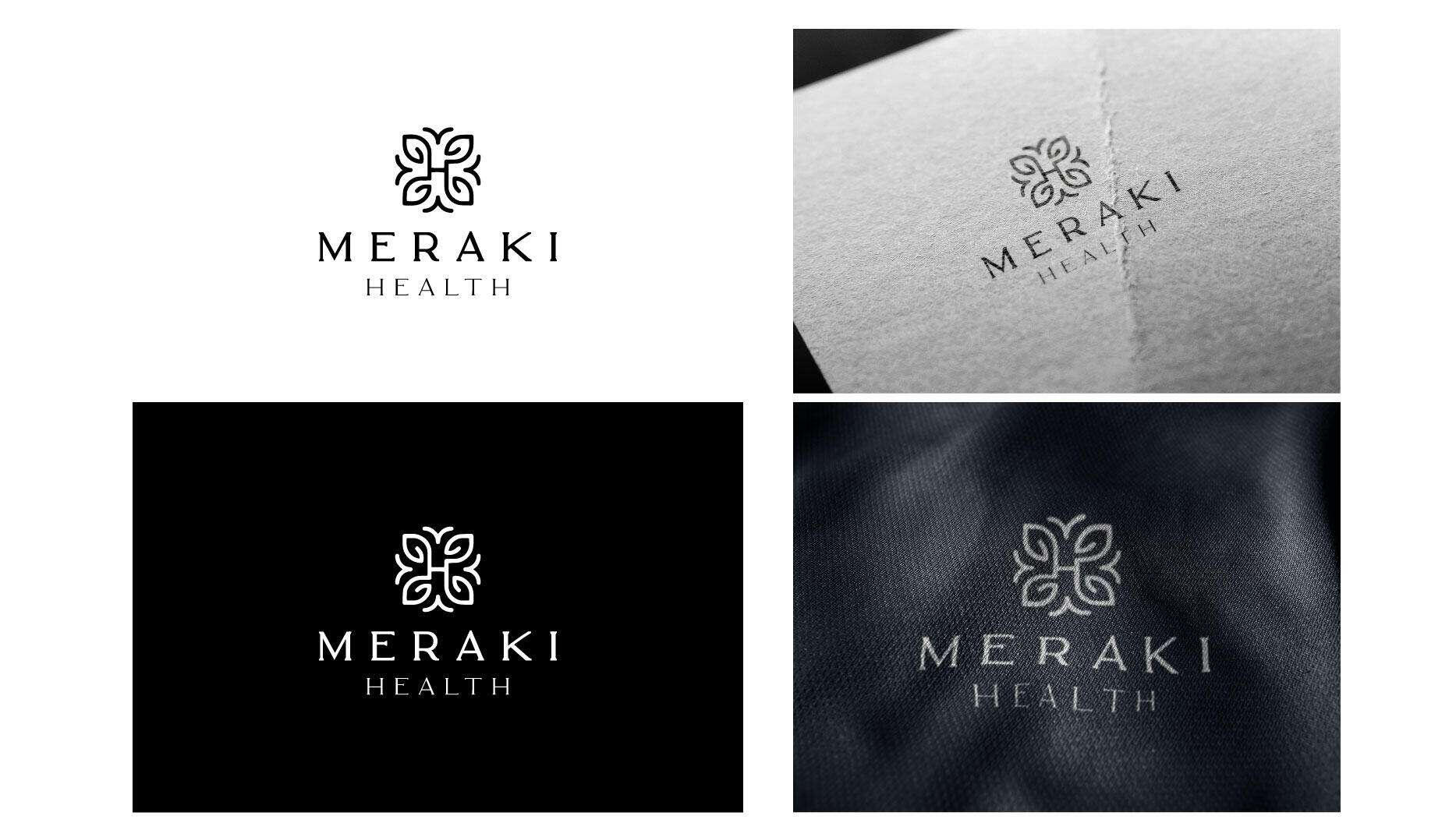
When we reviewed the first draft, we felt that the typography leaned a bit too much toward the conceptual side. That’s why we decided to bring more balance by choosing a typeface that’s less conceptual and more functional, something that could also work better in real-life environments like store signage.After that, we started working on the color scheme, aiming to reflect the brand’s vision and convey the right emotional tone through carefully chosen colors.
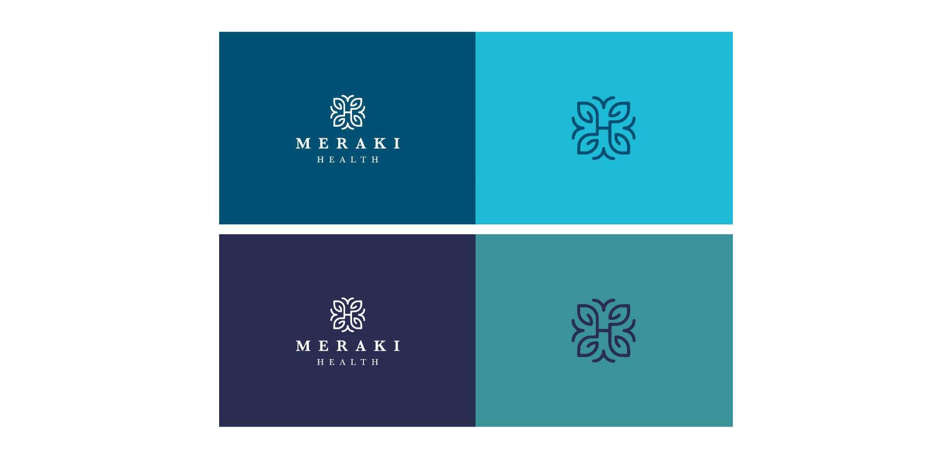
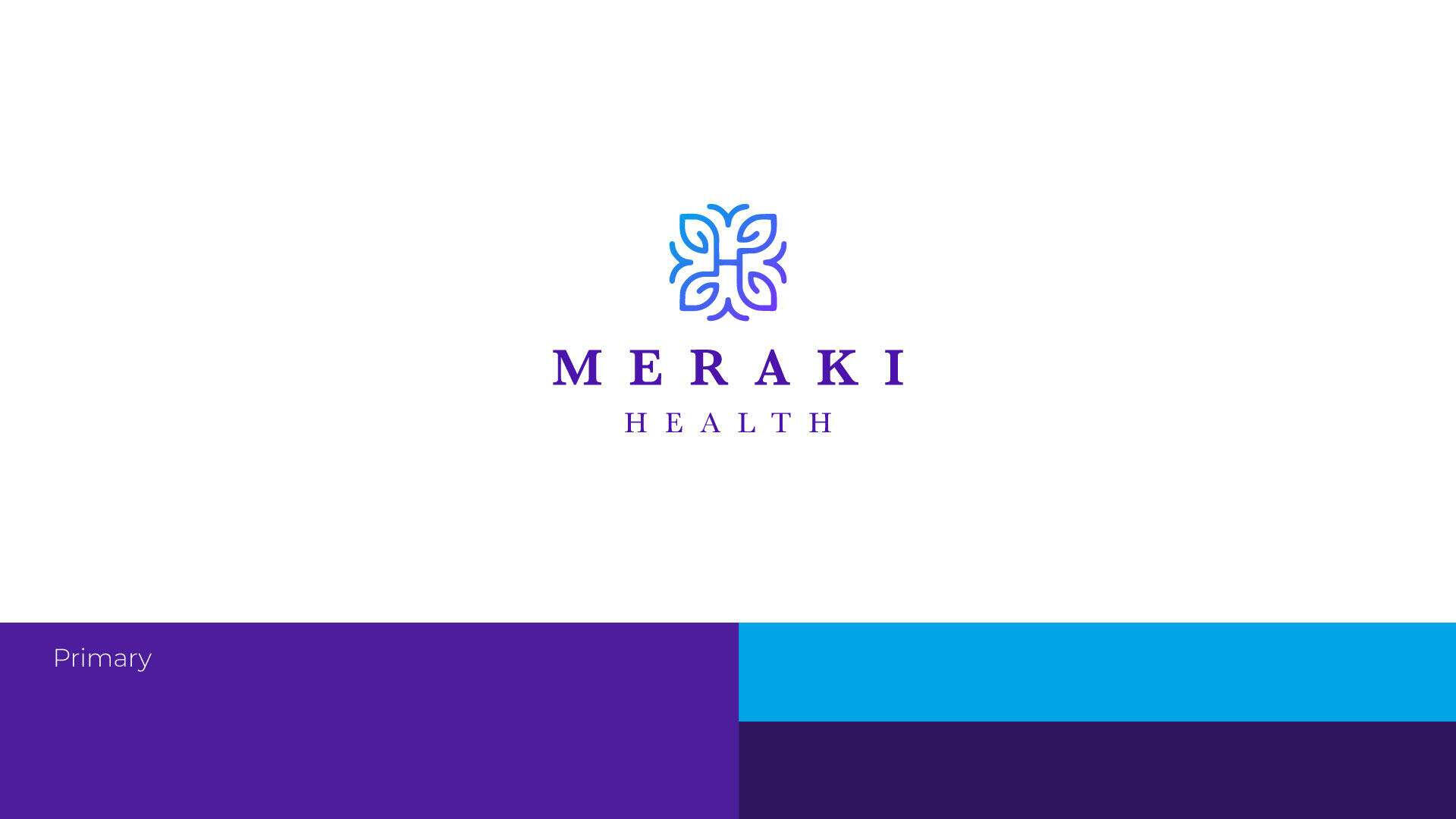
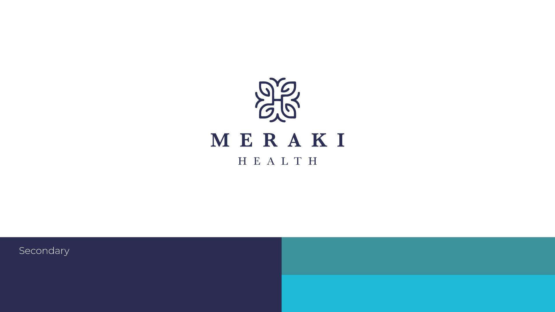
In the end, we decided to work with two color palettes: a primary and a secondary one.The primary palette is used for digital applications like the website, designed to give off a premium feel and to express Innovation.
The secondary palette is meant for print and on-site branding materials, carefully chosen to evoke a sense of relaxation and wellness within the physical space.
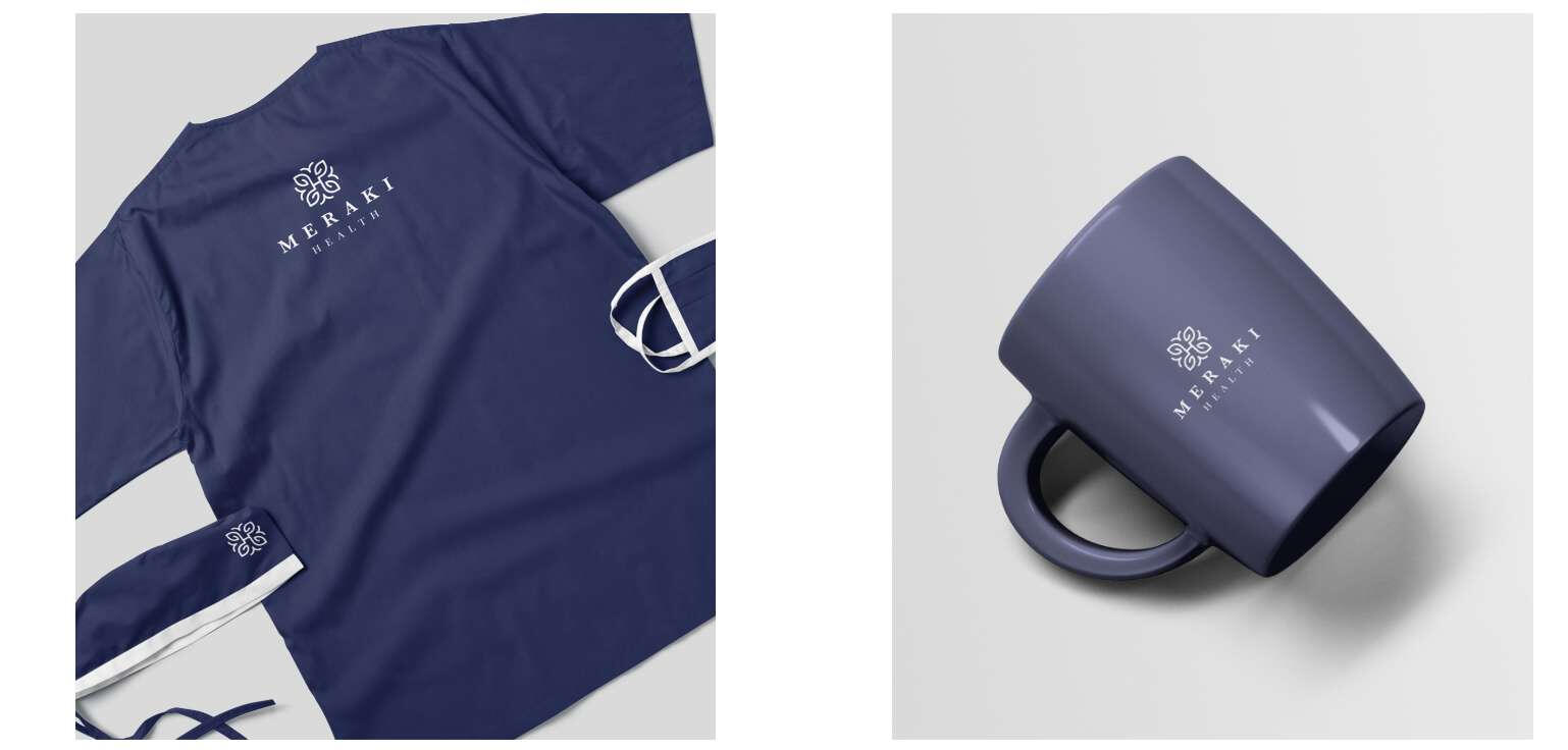
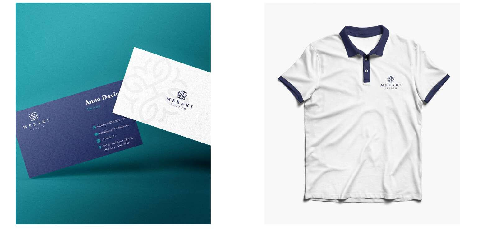
And of course, before moving on to the real-world execution phase, we always create a few mockups to test the direction.This helps us evaluate whether the outcome actually feels right and aligns with the intended experience—
or if adjustments are needed before final implementation.
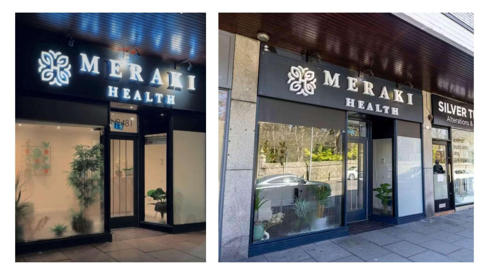
And after we tested everything, the client was really happy with the results we achieved and felt fully ready to enter the market and start operating in the real world.Thankfully, everything went smoothly, and the brand has been on the right track after a couple of months of real-life execution.
happy customers, happy us :D
The best thing of all is when the client’s customers themselves are happy and genuinely enjoying the experience.Design isn’t just about looking good—it’s about enhancing the entire experience.
Because at the end of the day, the one thing we truly aim for is a cohesive, smooth, and thoughtful experience that leaves people satisfied and emotionally connected to the brand.And I'm genuinely proud that my work plays a part in helping clients deliver that kind of impact.You can see the rest of the brand in action and how it’s working in the real world.
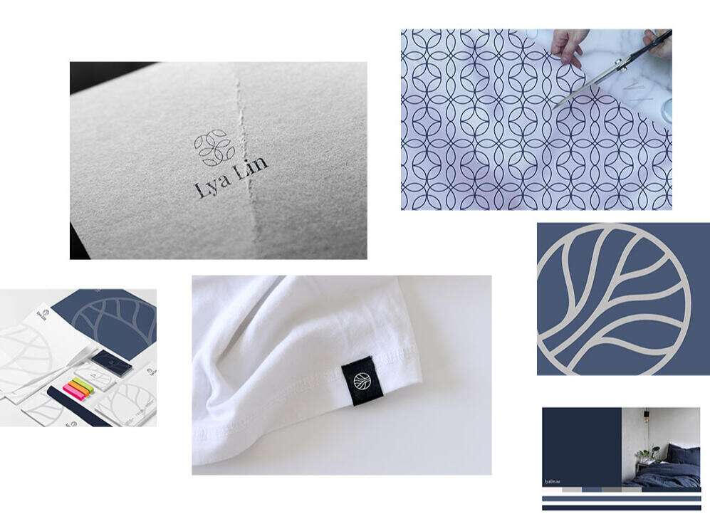
Lya Lin - Brand Design Case Study
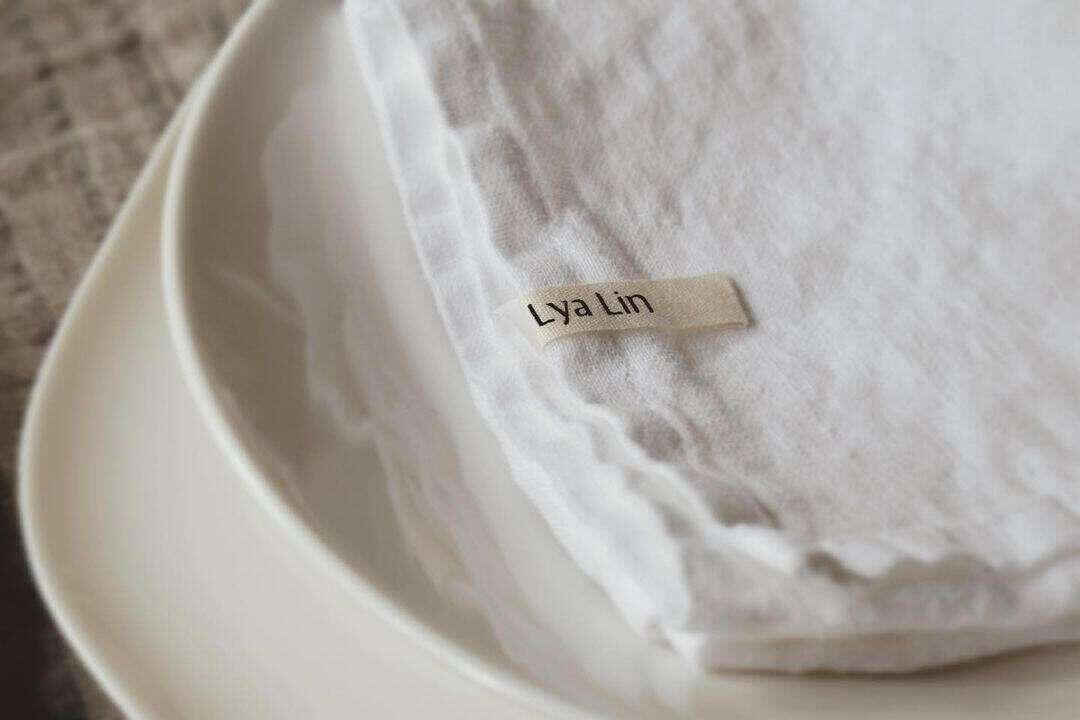
Lya Lin is a textile shop from sweden that offers bed linens, tablecloths, and linen products designed to add elegance and comfort to every room of the home.
My mission for this project was to develop a visual system that aligns with the brand’s vision and communicates its essence with clarity and beauty.At the beginning of any project, we always start with a consulting and discovery session to define the brand's goals and understand the client's needs and the outcomes they want to achieve.
After that, we set the milestones and the rest of the workflow.I like to keep the workflow smooth and the process simple so that the customer experience is as good as possible for the client.
After the first strategy session, we understood the brand’s goals and started a study on the environment in which the brand’s visual system especially the logo would exist.
This step is crucial so we can develop a system that’s responsive and compatible with all kinds of applications, whether digital or on physical objects.
We also defined the art direction for the logo. The client’s idea was to create a logo that includes an icon so it could work well in small spaces.
We also put together a small moodboard to give us the right feel and vibe for the desired outcome.
This was the first draft. The direction we followed was an icon-based logo that can be separated, with each element working in the space that suits it best. For example, in small spaces, the icon alone can be used, and when there’s more space, the full logo with the typography and icon can be used together.
We aimed to use colors that feel elegant and reflect the brand’s values.
From the logo, we also derived shapes and patterns that can help the brand become more expressive and dynamic.
Even though the first draft looked clean and elegant, the client later felt that the visual branding’s aesthetic might overshadow the beauty of the products themselves.
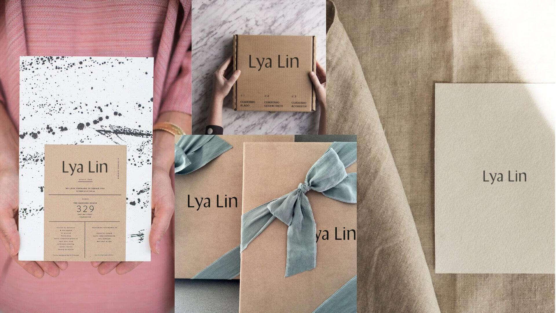
Her main goal was to create a product-oriented brand, with the focus more on the product than on the branding.So the direction we decided to explore was a quieter visual identity, everything minimalist.
The logo would be purely typographic, allowing people to feel the elegance in a subtle way, reflecting the values the client wants to communicate through her products.
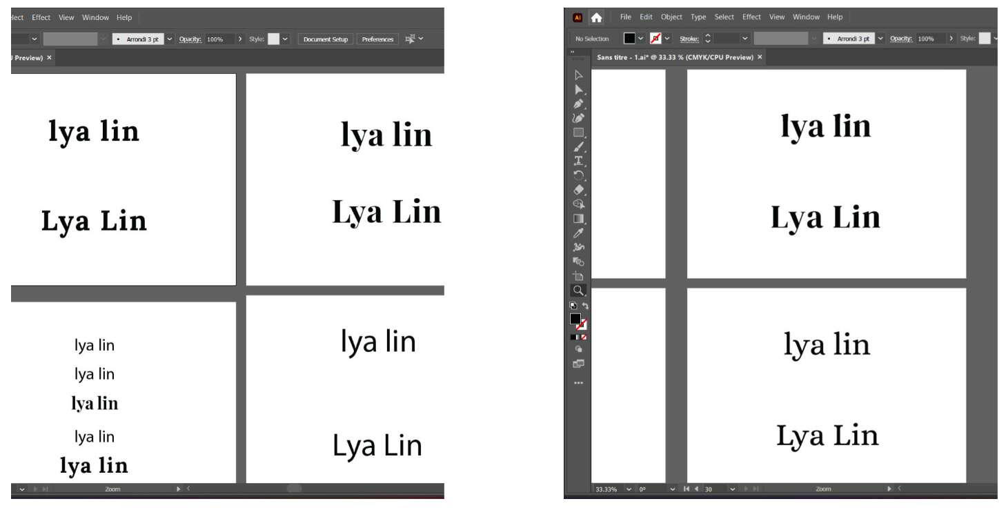
After we finalized the direction—which was to go with a typographic logo—the next challenge was to find a typeface that combines elegance, calmness, and also reflects a sense of craftsmanship, since all of Lya Lin’s products are handmade.That’s why, when we explored various typefaces that convey those feelings (like serif fonts) we couldn’t find anything that truly captured what we were aiming for.
So we decided to create our own custom typeface, blending elements of a smooth sans-serif with added serifs that form the foundation of that classic, refined look.
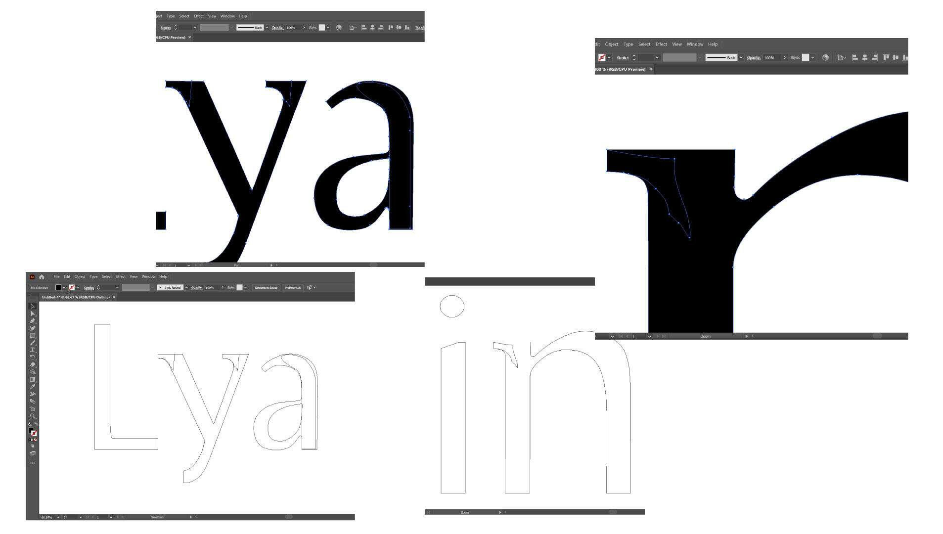
This mix gave us the exact result we were looking for: a logo that’s elegant and quiet, yet also reflects the effort and craftsmanship behind the products.
This is what we showcased in the mockups.
The client was very happy with the results, especially when we reached the implementation phase in the real world, which is the most critical stage. It’s the moment when you really see whether the ideas will work in practice or whether they were just a nice vision on paper.Thankfully, after a couple of months, we saw that we had truly achieved the result we were aiming for. The quiet branding direction worked beautifully and gave a clean, subtle touch to Lya Lin’s products.It made the brand feel elegant and calm, creating a refined contrast that allowed the products to shine in any space they were placed in.This was the final result brought to life.
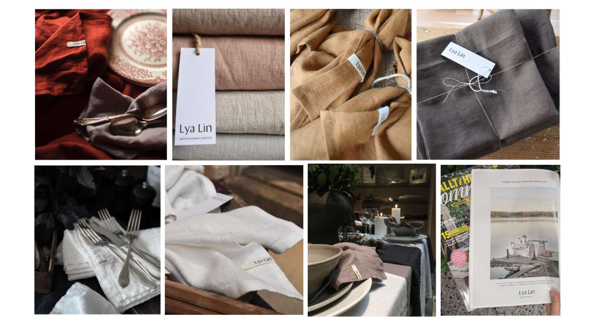
results speak for themselves
Brand design doesn’t always have to be loud or in your face to be considered good branding. Sometimes, even simple elements, like a custom-made basic font can create a powerful impact effortlessly.That’s why the most important part of branding is finding the right solutions and ideas that align with our goals, vision, and the emotions we want to convey through our products.
The Lya Lin project is a perfect example of this philosophy. As they say, less is more, and in this case, it truly was.You can see the rest of the brand in action and how it’s working in the real world.
Brand Boards
These are brands I’ve worked with across different industries, countries, and project scopes.
From strategy to final execution, each brand came with its own market challenges and unique requirements.Here are quick overviews, presented as Brand BoardsIf you’d like to see my workflow and how I collaborate with brands, you can explore the case studies in the "Work" section.
EuropeGirl - India
EuropeGirl Cosmetics is a beauty and makeup brand based in Mumbai that offers a wide range of professional makeup and beauty products for everyday and professional use. Their catalogue includes foundations, lipsticks, eyeshadows, primers, makeup tools, and other cosmetic essentials designed to enhance beauty with health-friendly, easy-to-use formulas. The brand focuses on premium quality, natural-feeling products that help customers look and feel confident and radiant.
Oasis Land - Cayman Islands
Oasis Land Development is a real estate company that helps international buyers purchase freehold land in the Cayman Islands. They specialise in offering legally registered land parcels across Grand Cayman, Cayman Brac, and Little Cayman, often with interest-free payment plans that can be completed online. Their service includes professionally surveyed land, official title registration, and guidance through the ownership process so buyers can secure and build on land in the Cayman Islands with confidence.
Smart Cloud - Malta
Smart Cloud is a Maltese cloud services provider that delivers scalable, secure, and locally hosted cloud solutions for businesses. They offer cloud hosting and VPS (virtual private servers), dedicated server hosting, and backup-as-a-service, all powered from a purpose-built data centre in Malta. Hosting services are designed to give companies flexible resources without the need to manage their own hardware, while meeting data protection and regulatory requirements. Smart Cloud focuses on security, reliability, and responsive support, helping businesses with their data storage, disaster recovery, and cloud infrastructure needs.
Energy Insider - United Kingdom
Energy Insider is a digital platform focused on supporting the energy sector’s workforce by creating tools and learning products that help attract, train, transition, and retain talent in the industry. They build engaging digital content, including career-focused resources and expert-led training, to make career pathways in oil, gas, renewables, and energy transition more visible and accessible. Their offerings include a careers platform with educational videos and workforce transition training designed to bridge skill gaps and empower professionals at different stages of their energy careers.
PIP International - Canada
PIP International is an agri-food technology company specializing in the development of sustainable plant-based protein ingredients. Based in Canada, the company focuses on advanced extraction methods to produce high-quality proteins, particularly from yellow peas, for use in a wide range of food and beverage applications. Their solutions are designed to deliver clean taste, strong functionality, and nutritional value while supporting environmentally responsible production. By combining innovation with sustainability, PIP International contributes to shaping the future of alternative protein and modern food systems.
Alucosun - Chaina/Spain
Alucosun is a global manufacturer specializing in high-performance aluminum façade solutions for modern architecture. The company develops and produces advanced materials such as aluminum composite panels, solid panels, and fire-rated systems designed for exterior cladding and architectural applications. With a strong focus on durability, safety, and design flexibility, Alucosun combines European standards with global manufacturing capabilities to deliver reliable and customizable solutions. Serving projects worldwide, the brand supports architects and developers in creating sustainable, visually impactful, and high-quality building exteriors.
NAHNOO - Jordan
NAHNOO is a youth-led non-governmental organization focused on promoting inclusive and participatory public policy-making in Lebanon. The organization engages in research, capacity building, and advocacy to empower citizens, particularly youth, to take an active role in shaping their communities. Its work centers around key areas such as public spaces, good governance, and cultural heritage, aiming to foster transparency, civic engagement, and social cohesion. By combining grassroots initiatives with data-driven approaches, NAHNOO contributes to building a more inclusive and accountable society.
Noola - South Africa
NOOLA is a South African baby lifestyle brand specializing in modern, high-quality parenting essentials. The company designs and curates products such as strollers, car seats, nursery items, and accessories that combine safety, functionality, and contemporary design. Built on the idea of “affordable luxury,” NOOLA focuses on making premium baby products accessible without compromising on quality or style. Through its direct-to-consumer model and growing retail presence, the brand supports modern parents with practical, well-designed solutions for everyday family life.
Contact
Have a project in mind? Let’s connect.
I’m always open to collaborating on exciting ideas. Share a bit about what you're working on and I’ll get back to you soon.
Thank you
Thank you!
Your message has been received. I’ll get back to you as soon as possible. Looking forward to connecting!